Friday, July 29, 2016

A heritage photo sort of

Actually its more of a comparison photo all in one.
So I started with this wordy paper from Studio Calico 
and some Tim Holtz embellishment pack.
Don't you love that hat.
 I have to admit I got carried away with the layering.
It was like I couldn't stop.

 And I jumped back on the button bandwagon.
And might I point out that itty bitty gold heart.
If you'll remember I posted a page of Quintin with his dad in 
that little mini book for mom.
It appears that the apples don't fall far from the tree. 
How cool is that. 
Triplets.

Thursday, July 28, 2016

Anyone else having trouble with white mists?

I really love having white mists on a page
and if you look at those grayish looking ones - that's
Heidi Swapp's white mist that I shook shook shook - 
I also have a recollections white mist - same result -
so when I tried a different tack - when
I altered the color on the title I tossed some white paint around.
That's the look I was going for.
 So that adorable little owl looked more red under my light.
hmmmm...he's on there now........
 And how about those glasses on the PL card - 
goes perfectly with momma's glasses.
And finally used that flower from Basic Grey.
How cool is that title...from M's $1.50 bin.
It had some pale yellow and tan hombre going on
that didn't fit with the rest - so I painted it white
to stand out more.
Although now looking at it, it may have worked
in its natural state.

Studio Calico, Bella Blvd (owl), Basic Grey (flower).
OH and I used the Martha Stewart heart confetti punch for
with the gold paper and oooooooo some are itty bitty but oh so
adorable.

Wednesday, July 27, 2016

Layers and tissue paper

Used quite a bit of layers behind the photos.
Love that and adhered it to some tissue paper - as sort of a base.
 And here's that cute, adorable bunny again
peeking out. He is sooo stinkin' cute.
 Those itty bitty pearls were a pain to put on.
They kept rolling around and my fat fingers had a hard time
and using the tweezer bees LOL - Good thing there
were a lot in the pack. I ended up wearing quite a few too.
 Of course I agonized about the title.
I really couldn't find the color I wanted, nor the size
nor the actual words. I tried princess - but arrrghh.
Then I decided her name was royal enough.
I found some paper that sort of matched everything
and broke out my QK - anyone remember
the Emily font???
I only have the lower case but I think
they worked out - its a beautiful font and back in the day,
 I used to be quite the font junkie.
Didn't matter dies or stamps.

Studio Calico, QK, Spare Parts flowers, Tim Holtz
phrases. Unknown butterfly.

Tuesday, July 26, 2016

B&W photo in sequence

Again.
Especially with the sequence.
I was poking around in some of my older photo folders
(say that 3 times fast)
and found this gem which I thought I 
scrapped.
But I couldn't find a page so even if I did scrap it before,
who cares. No rules.
 I scrapped this page at Holli's as well, and
shock upon shock, I actually completed 2 pages and she finished
her baby album she was doing.
Who rocked the scrappin'!
Us!
 She also had that bunny stamp - which she let me
stamp a page full of bunnies for later use.
Is he not adorable?
You'll be seeing a lot of him too.

I also borrowed some flowers. 
Oh and that gold doily came from Holli's place too.
Come to think of it I really didn't supply much.
I love shopping at Holli's place - LOL!!! She has tons
of really cool stuff.
Thanks Holli for the cool stuff and ideas!!!

Love how this turned out and I want points for working
in that pink house.

Studio Calico, prima, Michael's $1.50 bin.

Monday, July 25, 2016

Overthinking a page

 Can drive you absolutely nuts.
Fortunately, I was hanging with my pal Holli and
we were scrappin' together at her place and after
bouncing some ideas off each other - she hit one!
Strips.
Doh!
So simple, yet fun.
So I whacked a few strips, put them behind the photo
and wa-la instant mat on a very colorful page.
And how about that adorable bird.
Sigh....
Holli also supplied the splat punch for that fun splat.
LOL....

I love this photo! 
Lou totally exemplifies the fun I have in scrapping.
His enthusiastic crafting at his cousins
crafting party made me smile.
I feel the same way Lou when I have paint in my hand.
This turned out really fun and Holli once again
came through with the title!!
Studio Calico, Tim Holtz, one itty bitty piece of Basic Grey
and Michael's $1.50 bin (I'm telling you it rocks).

So I'm packing for our 2016 Summer Tour and its
a good think I looked at my lil album again.
I pretty much did a lot of stuff, so I just need to add journaling
and photos, but I did toss in some extras in case
I need to add more pages.

Friday, July 22, 2016

Happy Friday Happy Moment

Don't know who was more excited about this
mom or Amelia. Mom has been
waiting for a little girl in order to attend this bash.
This Studio Calico paper is perfect for the
Fairy Garden Party and of course Miss Amelia is
dressed for the part.
 Fun layers going on as I picked out gold and pink
to accent the page.
 Lots of fun little doodads scattered about and I'm
in a pearl and bling kind of mood this week.
It'll probably roll into next week too.
How about those gold birds?? and doesn't that bow
make you swoon too?
Love having gold paper around that I can punch
different accents out.
It was fun to do and I love Miss Amelia being a beautiful
little fairy flitting about.

Thursday, July 21, 2016

Yellow and pink - so pretty together

This Studio Calico paper is so pretty and girly
and I actually had a b&w photo ready to go for it
until I looked closely at those itty bitty flowers and found
some pink in there.
 So I switched it up for this girly photo of Annie.
I did print them in "sequence" however, when they printed out
the blue line was cut off in that first photo so it looked
like she lost an eyeball so I shifted them around so that the blue
gives an edge to the photo.
 I have a really OLD stash of prima flowers that has
really been whittled down over the past years
so I had to really dig to find these.
(I'm trying to stash bust so I really didn't want to buy more)
And honestly they really worked out lovely.
Out of the $1.50 bin at M's were those beautiful pearls that
are finding their way onto more pages.
 And doilies - don't they make you swoon.
I was hunting down photos when I came across this one
which is older because Annie girl just turned 5.
I know. Time flies.
I'm pretty sure I did this before but it didn't 
ring a bell so I did it again.
No rules about that in scrapbooking.
I didn't add any mists because I really just love
this look as is. Old School.
I'm loving sequence photos at the moment
so of course they'll be used ad nauseam.
I did frame the entire page with regular stitching.
I think it came out darling.
And girly.

Wednesday, July 20, 2016

Its all about the hearts

 And Miss Amelia has mine for sure.
Love the photos I get from her mama - they
tend to bring out the inner artist in me.
So I whipped out the QK nesting hearts and whacked
them in different Bella Blvd. papers.
I fixed the hearts so I could use the outline and then
also separated them to make hearts.
And found out that the majority of those die cut hearts were too big.
So I broke out the punch and some different colored
patterned paper because the Bella Blvd. all looked the same.
 It also looked a bit to white so I used some watercolors in
gold, teal and pink. Of which the pink you can hardly see.
And because I could I used a gold marker I doodled around the edge
and made some really sloppy hearts.
And those pearls - don't they make you swoon.
I also broke out the QK square nesting die cuts and
anchored them around because I just
felt more was needed.
Of course a girly page wouldn't be complete without gold
hearts and butterflies.
I love the photo and her hairdo and her pose and smile kind of 
remind me of Audrey Hepburn.
To be that poised at 5.
I was a messy little tomboy with a pixie 'do LOL.
All of which resulted in me finally getting to use the "classy" title
from Studio Calico.


Tuesday, July 19, 2016

Some old Basic Grey for a boy page

I really love Basic Grey - that was always
almost my go to paper when I was
scrapped. I'm still bummed it went out of business.
When I saw this photo of Owen and Lucy I knew
that this really old paper would do the trick.
 It has the outdoor feel as well as leaning toward "manly."
 That PL card is also perfect as an additional title
and that little bird still slays me.
 A PL card at the top also adds to the "journaling."
Add tidbits on the side to kind of balance out all the
action that happening in the middle of the page.
It turned out to be a fun page with the photo 
in between all the "fireworks" of brown that also highlight
the photo and all the action down the middle!

Lucy is such a sweet dog and adores her kidlets.
She loves me too - always greeting me by knocking me off my feet. LOL.
Its also really neat to have a photo of their house in the background.

Basic Grey, Studio Calico, Tim Holtz stamp, EK Success, M's $1.50 bin.

Monday, July 18, 2016

Out of the mists arises a page

 You may remember this disaster from last week....when I dumped a half bottle of Mr. Huey all over my desk. I did have the presence of mind to clean up before more damage was done and then take the photo.

I did post this on Scrapaholics Anonymous for some well deserved sympathy and while not exactly a challenge, someone mentioned seeing the final product if I ever used the paper.

And I did.

After I completed the page I flipped it over to add all the goodies as I always do and it was hot pink and polka dots with a green blob.. which would've looked cool too but honestly where's the challenge in hot pink and green LOL.

So I decided to make another green "blob" on the other
side of the paper to balance it so to speak
and tossed some more of the mist about. 
I really like the color so I need to think about ordering more.

 I wanted to keep it kind of light and airy so 
I used those QK squares with some small accents
again, keeping to the green.
 The green was kind of getting carried away
so I found some cardstock really close
to the color of the page and added them as "filler."

I really love how it turned out and in hindsight
I would never have thought of using green.
Got to use some Heidi Swapp hearts and finally that
enamel flower. 

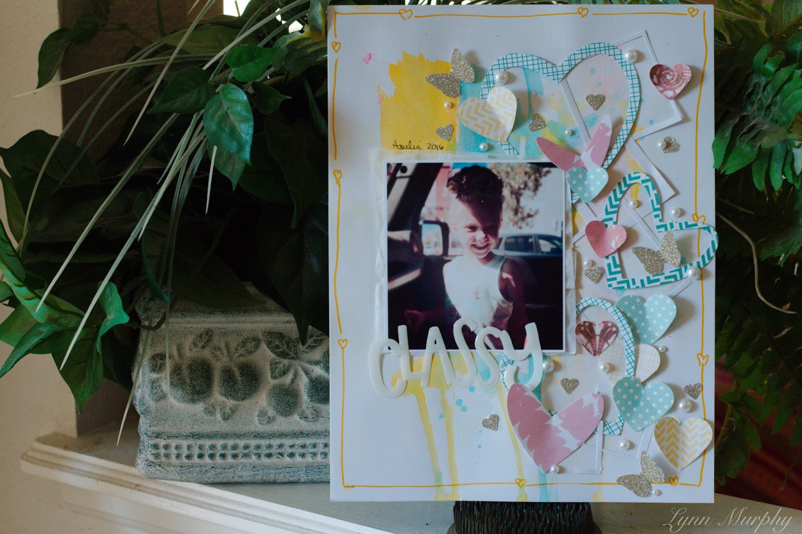
I had a blast taking these photos of these two favorite nieces
and at first they were 
all about the posing and then Caralynn decided
she was basically done when I was taking this one. When
I saw her "look" as I was taking it, it has
become my total favorite out of the bunch because it was so natural.
So that look was aimed at me and I was totally cracking up
behind the camera.
The journaling is also on the back because did I remember
to make a spot on the page. 
UH No......

Friday, July 15, 2016

Celebrating Five!

A milestone birthday to be sure.
Going to real school - kindergarten!
Miss Annie seemed to rock all the parties.
There were several.
So lets start out with the fact that her birthday is in July.
Did I think of using "July" paper.
Not until now LOL.
And there you have it.
However, I do love the papers I picked out.
 Used a couple of PL cards by cutting out the
necessary sentiments - 
 Then there's that ticket with the 5 on it.
I picked that ticket up a bazillion times when I didn't need it
and could I find it when I needed it for this page?
NO.
I dumped the entire die cut box out to search - which turned out
to be a win-win because I culled through and
tossed a bunch out - 
mostly bent, broken or partials were picked out
and there were a bunch.
This is also the page in which I uncapped the Mr. Huey's garden mist
to toss about on the page and ended up spilling
the mist all over my desk and on 
papers and embellies that I just unboxed from
Studio Calico July kit.
There's gonna be some creative scrapping going on to save them.

I'm totally open to suggestions LOL.

Thursday, July 14, 2016

Sort of a chaotic mess

I'm really trying to figure out how it happened.
It was sort of like spaghetti - no matter how much you 
toss on there it just keeps getting bigger.
 I tossed
on a bit of gesso and some mists
using again the packaging technique and it just
went ka-boom.
On another note - 
Love that bird - he really makes me smile.
 So the mists sort of went everywhere, in non matching colors.
And seriously, there were so many colors on the
paper and what does Lynn do? Pick the
colors that weren't there.
Which honestly took the fun out of the page
as I kept looking at it.
So I figured I'd try and cover things up - but
this time I managed to get it so it
really couldn't be covered up.
Therefore,
 Since it was already out of control - I piled on.
I mean why not.
Gotta roll with the mists you splattered.
I threw on a 
disconnected title with some randomly placed stuff
all around because if you're gonna
be chaotic - make it CHAOTIC.
 I'm still wondering what went wrong.
LOL.
I had a vision and I'm pretty sure this wasn't it but
the pictures are fun and I think that started it,
after all leaping from rocks into thin air
is very daring.
I think the doodling pulled it all together.
LOL.
Studio Calico, Tim Holtz stamp and words, mists and
assorted bits.

Wednesday, July 13, 2016

Cardstock as a base....

Because somewhere in my scrapping frenzy
I took a hunk out of this paper
and there wasn't enough - not even for a 8x8.
So.....I found some matching cardstock and used that as a base.
 And that's nothing new, I just haven't done it in awhile.
I've been looking back on pages and there's
lots of things I don't do anymore.
And there's no reason why.
Pointing out that eagle is QK die - isn't he snappy.
Itty bitty stars - yum - I seriously need to pick
up more glitter paper.
 It's perfect patriotic paper - Studio Calico and found
some more colored cardstock to make my "fireworks" -that
I had to resort using the top of a pineapple die cut
for the "boom.
I had a "grass" punch that made and an excellent firework - but I can't find it.
And I'm totally bummed because that was one of the first
punches I ever purchased and I know I wouldn't have
given it away. I tore everything up looking for it
to no avail.
Love the photo of the kidlets with their sparklers.
It reminded me of the three musketeers!
Therefore assorted alphas for the title because naturally I didn't have
all the letters needed to complete some words.
I know I'm surprised.
Actually this was fun to make - the photo is cool
and having to work around my missing punch
added some lively moments.
It's really making me crazy I can't find it.


Tuesday, July 12, 2016

So that girly skull and crossbones - used it!

It just happened to work for this page and
its not just for Halloween.
I did put some enamel hearts on the eyes as they are
shaped as hearts anyway it just seemed to highlight the girly-ness.
I did get carried away with the packaging technique.
 I also didn't use gesso either.
Which could explain a lot.
Anyway when I photographed this with the title
"strong" it was grey.
And I found hard to read. 
The color worked, but alas....
 For the final - I did go back and rub some
white paint and shabby chic'd it up
which makes it a tad more readable.
Love how this turned out.
Studio Calico, Stampin' up skull.
Miss Amelia is in tip top shape and she looks adorable doing it!