Monday, February 29, 2016

Embellish DIY Style

As you know I love Ashli's style and I have a tendency
to stalk,  er check her blog out daily.
Well I took her Embellish DIY Course and have
viewed it several times and did a few of my own pages
but THIS PAGE is the most DIY yet.
 All those pre-made stickers and tags available are so
freakin' adorable, however, sometimes the
colors or size just doesn't work - so for this page - I made my own.
Not quite as handmade as Ashli BUT homemade all the same.
I punched out circles and squares because I really suck at scissors LOL.
I finally made peace with the fact of hand cutting mats and photos instead of
using a trimmer- so baby steps.
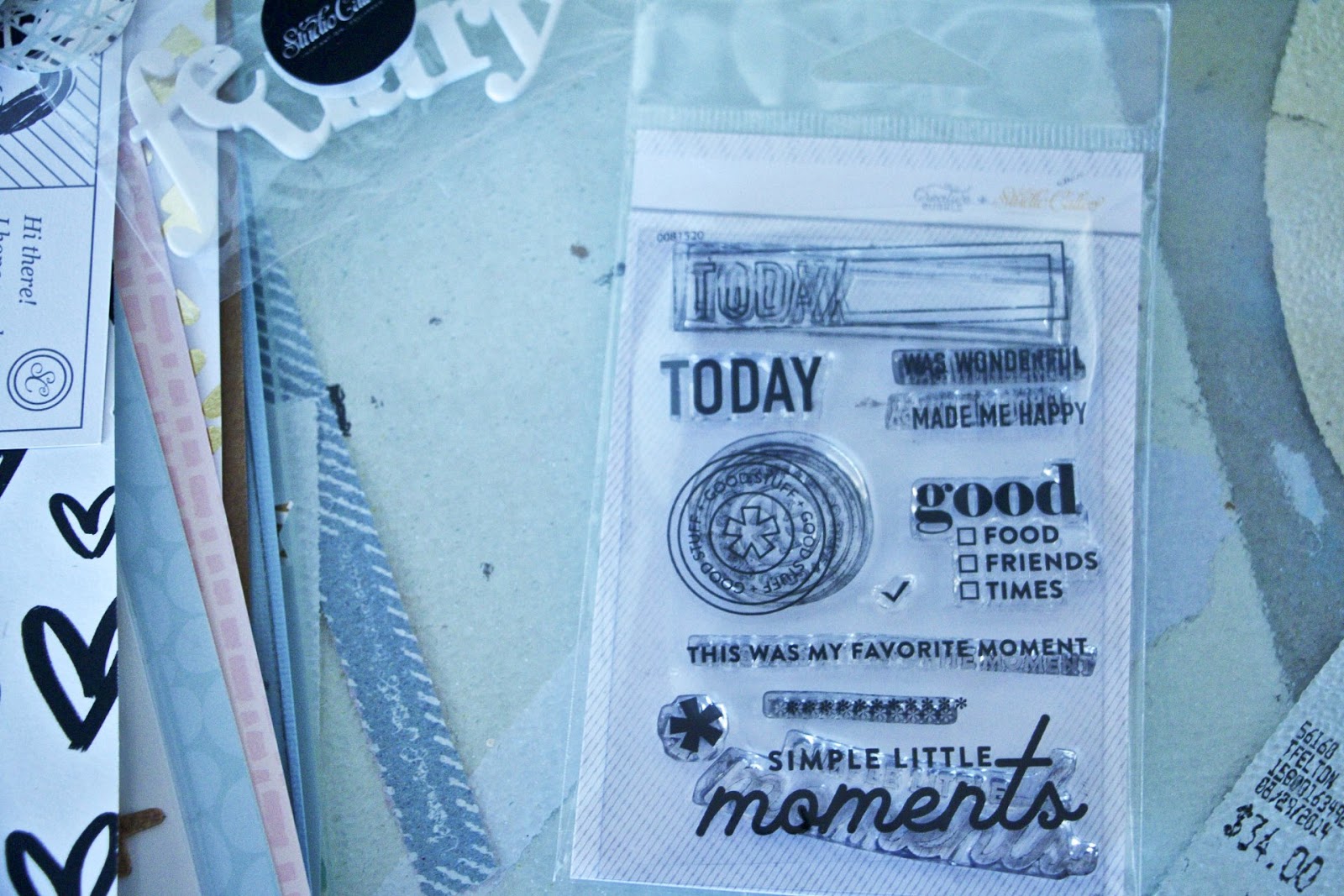
I then broke out my Dear Lizzy stamps (and Studio Calico) - I adore
this stamp set and use it a lot. 
So I stamped on the squares and circles - I KNOW....
I also stamped around.
The feathers were fussy cut too.
The hardest part is covering stuff up.
I want to see it all. LOL
Ashli explains that too. 
 Got some shadows going on here.
Early morning. OOps.
 Love how fun it was to do and I'll be doing more of it.
Studio Calico with mix of Basic Grey papers.

Miss Amelia doing what she does best - trying to defy gravity.

Anyhoo, check out Miss Ashli's class.

Friday, February 26, 2016

Fussy cut layers

I was really stumped for a title for the blog so work with me here.
This is a Shimelle collection (the first) and it was
fun to work with because while its about travel
it can be used for 2 little dudes walking through their 'hood.
Anyway the layers just kept rolling and I love 
one of her pages that has those clocks, scales and phones and
cups among other things so I just fussy cut them out
and layered them in along with some wooden hearts and papers.
And that ampersand was a new stamp.
 I love the ledger paper and used the preprinted designs 
to set the photo and layers in.
 The bow is not Shimelle papers but it works so well 
with Sam's coat - so another goodie
out of my die cut box used.
And that ladybug peeking out....isn't that adorable.
And man the sun was bright this morning trying to
photograph this page, but it worked.
Mist by Heidi.....
One stamp is Shimelle's the other is Studio Calico and the
title was a bounce off - whenever I am stumped
for a title my pal April always has an idea - she came up
with winter buddies which was fun......
but it led me to baby it's cold and I love it.
We have a great process - 
do you have a scrap buddy that you can bounce things off?
I miss our cyberscrapping days - 

Thursday, February 25, 2016

Evolution of a finished page

Raise your hand if you thought a page was done
and then decided that nope....it needed
just a bit more something - something.
Well on this page it happened
twice.
Love the cluster at the top and it sort of evolved
and it appears I'm diggin' the doily.
 I decided to be quite wild and do a cluster on
the side - I don't think I've quite done one
that I can recall. 
That poor cotton candy sticker was off and on
many times and looked a bit worn
so I threw some stickles on and it looked really
dumb next to the gold heart so
I wiped it off and decided that stamps would
cover up the "worn" look.

And the title - love that little bow.
So I called it a day and when I looked at the page
once I took the picture it - it was a nice page but it
looked incomplete to me so.........
 I used the wand on the same Heidi Swapp mists I used 
and drew lines around the edge and I really liked that as well
and called it "done." Again.
But wait.....
 somehow when I glued everything down - the photo shifted
on the pink circle mat and the right side
bothered me because it seemed "off" to me -
as in too much pink and then
I thought I didn't use any word strips and I'm on
a mission to use them up......so
 I found some that worked and NOW
I feel that the page is completed.
Each "ending" was good BUT - I'm glad I
just kept going a bit more.

All Studio Calico - except for the mist.


Wednesday, February 24, 2016

Adding ephemera to your page

I do love keeping ephemera although
tickets are really not the same anymore as
they can be printed now and aren't as snappy as
the used to be, however, you can see the
price, it has a date, and pretty much
does a lot of the journaling for you.
It's also neat that peeps down the line can see
what you were up to.
I did cut the tickets down from 8.5x11 paper they were
printed on and then of course the wrist bands
that really don't match anything on the page and I'm 
okay with that.
My DH knows that items like these are to be saved - and
he does it well since he tends to be the keeper of said items.
 The background was created with gelatos (the first page I got
WAY too carried away and had to start again).
I'm okay with the gelatos BUT  I don't feel mine are as amazing
as Wilna's or Adele's therefore the majority
has been covered up.
 Well dang now the "title" can't be seen well here
but IRL it's okay. I struggled with 3 styles of alphas
in several different places. Sigh.
But aren't those Heidi Swapp hearts peeking out adorable?
We attended the Blues Seafood Festival with our
friends with the express intent in seeing
Beth Hart - she is an amazing singer and performer.
She's sort of like Janis Joplin on steriods only Beth can 
actually sing. I discovered her lovely self
when she did several albums with Joe Bonnamassa
and we all know how I feel about him.
Best Blues guitarist ever.
I was actually impressed with my bad self getting photos
of a concert that turned out decent.
I really would've liked to smack some people's heads
out of the way though.
Just sayin....

Anyway the paper is the Paper Studio and Recollections
cardstock backing it with some gelatos and
Studio Calico thrown in.

Tuesday, February 23, 2016

Pointer pages in regular album

That point you to "The Album."

For those of you that followed our 2 month
travel escapade you'll remember that I did an album
as we went, so except for one page the
entire album was completed before we returned home.
I know it still boggles my mind as well.
This album is the West of the Mississippi Tour.
 This double spread (more or less) are our adventures
in Yellowstone park - And yes I did get the kit from the park store.
As you may or may not know, Tom and I don't do a lot
of pictures of ourselves and I decided that
we were going to include some for this trip because 
why not. 
So to make a statement or two, I printed the photo 8.5x11
and decided to scrap straight on that photo.
 With a note on the page to check out our road trip album
for more details.
 Because the story of this photo was fun.
 It's a gorgeous place and if you ever want to
go anywhere and only one place to go
check out Yellowstone Park.
You will NOT be disappointed.
 And because we took another photo together
that had another fun story with it, I printed two of them
because I wanted to frame one. When I
decided the photo to be frame needed to be tweaked,
I decided to scrap the second 8.5x11.
The Grand Tetons are the breathtaking mountains
you see on the ride to Yellowstone - if you're coming in
from Jackson Hole Wyoming - you
get a gorgeous ride to a phenomenal park.
Win-win.
Of course we stopped at the ranger station to get our
passport stamped and I picked up a couple of do-dads perfect
for scrapping.
Again pointing out the road trip album.
 Love how these 2 pages turned out and I
may also pull out other photos - maybe to tell a bigger story.
Its pretty hard to do that because it was so cool scrapping
as we went so the stories have already been told.

I also have a better idea of what to take now
although stopping at a scrapbook shop on the road
was a total win and I documented that.
If you go back through my posts started about mid-July in 2015
you can read about our exploits starting with Packed and Ready to Go.

The photos in my road trip album were printed from Canon Selphy printer.
Its a great road trip printer - small and compact however, the largest
photo size is 4x6.
It is also not the most cost effective printer but it was the convenience
of being able to have the prints instead of adding
them after the fact...
I also kept a separate "daily journal" that I'm going to
try to combine this next time around.

Monday, February 22, 2016

Vellum on your whole page

In this case I used the whole piece
because the minute I saw it - I loved it, and
it was perfect for this photo of Shane.
I remember having a manual typewriter and having
papers turn out like this.
Hmmm if I had another piece I could do an entire page about that.
Anyhoo.....
the gold blobs. 
I have always wondered and, I know you have too,
how some scrappers can flick sweet little mists on by tapping 
with ONLY their index finger (while I, and others I'm sure,
 Have to Pound ON it to get said flicks).
Well after this "pound on it mist spreading adventure"
 -I found they were using Heidi Swapp mists.
Her mists flick so easy that you really have to pay attention.
So take heed and be warned.

 I cut out this heart from a cut apart as an added pop
and the gears and metal to make it manly
as well as the subtle "go for it."
It brings down the white and actually works.
I bought a pack of those feathers from HL and
there are different colors in the pack - I used the
gold because it worked with the overall page.

Studio Calico, my houndstooth Paper Issues (I neeeed more)
and bits and pieces.

Friday, February 19, 2016

Stamping, Stamps, Stamping

I'm beginning to love stamps and Studio Calico
started a new thing and this month I was
able to pick between 2 stamp packages prior to receiving the kit
and I picked this one.
And once again, I used most all of them
several times.
 I found it seems to make more of an impact using
them all - several times and adds
a cool background layer - I got this idea from Kitty Scrapper.
If you haven't seen her stuff - look her up.
She's fun.
I did get carried away a bit with the snowflakes.
Okay a lot carried away.
In my defense I live in Florida so seriously how often will
I get to to use it.
Of course what's snowflakes without a bit of sparkle
and shine - not to mention different colors.
 Got some layers going on - don't layers make you swoon.
And that little stamped kitty is a whimsical twist.
 I also used the stamp to put a border around the page it kindof
looks like my sewing so.....
it sort of worked out well and it was
really an afterthought.

Studio Calico.

Thursday, February 18, 2016

Big tag and fussy cut

I love big tags and I really don't use them
often enough. This one was
homemade - because the ones I had just weren't
the right color.
The tag works both as a "sort of mat" and for journaling.
 I love the paper issues "I have issues cards" and
this one had a fox on it which works so well here that
I just fussy cut it out.
I'd love to use with the "I have issues" sentiment
but I'm afraid people may not take it the right way. LOL.
 That itty bitty fussy cut fox in the corner there
was tricky - but it worked out.
 I added a bit of stamping here there for background and layers.
This turned out adorable.
Sam is adorable.
Basic Grey.

Wednesday, February 17, 2016

Forgot to add a title

Titles are important - if they're good they draw the reader into your page.
For some reason I didn't title this page
and as of this minute my mind is blank so I'm
gonna just roll with that because...
well, the photos are pretty obvious and I kind of like
it without a title being that in the
design especially as there's not a lot of room leftover for one.

 Trying to use up my Basic Grey stash - and there is 
a ton as well as a bunch of PL cards.
That swirly thing and splat are from my new
Tim Holtz die cuts - love them and as promised I'm
using them a lot.

I'd ask for a title but I have sent this off.
Oooopps
But I'd love to hear what your title would be.
I can always jack it for the next snowy one LOL.

Tuesday, February 16, 2016

Sometimes its the backstory

Every now and then you run across photos
that have an amazing backstory.
First off - doesn't Amelia look adorable in those
glasses. How do kids that age know a style.
I agonize over picking out glasses and such - and I 
just don't do it well - but that's not the story.
 Amelia and Marcus met in daycare and/or on the bus.
He was an autistic/heroin baby that had and has a lot of issues
most of them being social in addition to a lot of health problems.
 It appears that Amelia broke through all
that and they've become fast friends.

Studio Calico.


Monday, February 15, 2016

Blatant page lift

I love doing lifts and learning different styles, don't you?
The best way to do that is lifting either in bits
and pieces or doing the whole darn thing.
Well.........
This page is a blatant lift of Eyoung Lee.
She has a beautiful, clean style and I happened upon
her on Google+ and started following.
My page isn't "pretty" or "romantic" like hers (the original) but I like how 
mine turned out all the same. It's fun.
Love these strips and I've been slowly working my
way through them - almost gone. 
 This transparency is fun and the last one
from the Studio Calico kit - Love that I'm using all the supplies.
Do you find that you save some embellishments and paper for "good". LOL.
("For good" is a saying for back in the day when you
dressed in your best for special occasions - that dress or
shoes you keep in the closet for only then.)
And didn't I just date myself there.
I seriously have a need to work through that.
 My elements didn't exactly work the same
on the page as hers but I still like the design.
Mixed into this page is "shades of Soaphousemama" and
the Embellishment DIY Class I took from her.
(upside down houses - a whimsical twist).
I like that.
Ashli has a very unique style as well and she's alot of fun to follow.
I used the glassine packages to mat the photo-
love the packaging and neeeeed more.
Everything Studio Calico except the heart
which is Bella Blvd.

Friday, February 12, 2016

8x8 Pocket Page

Happy Friday!
I have no idea where this pocket page
came from and seems I have
only one - so far.
But I decided to give it a go.
And I really like how both turned out.
 I may have to look into getting more of these.
The cards came from my "box of stuff."
Soooo....you're on your own here.
My bad.
Actually, some studio calico, kelly purkey, 
paper issues swag bag.
More or less......

Thursday, February 11, 2016

Last Christmas paper standing

 I didn't get very much Christmas paper
in the Basic Grey warehouse haul (except in 6x6 pad) that
when I came across this photo and
couldn't believe it wasn't scrapped well.....
so I'm very glad I used the remaining paper up.
 And sticker sheets - galore, I have enough
for next year's stuff LOL which is cool - so that'll go
with the remaining 6x6 paper.
Love how a plan comes through.
Grabbing the stickers, I just started layering and actually
committing to sticking them down which
is very unusual for me.
I usually map everything out prior to making a commitment.
Of course, some came up, some were laid over
and some were moved.
It was fun.
 And I didn't get wiggy about not having the
same color alphas either.
I'm glad they were the same font though.
One can only break bad a bit at a time. LOL.
So I had this all ready to go and when I
looked at the photo I decided the page needed a border
therefore, I added a border with a very old brown micron pen
that had just enough ink in it to make the border, then 
tossed the pen and then rephotographed the page.
Looks way better outlined.
So everything is Basic Grey - including the alphas
and they are old. Really old.
Love that the colors match throughout their lines.