Showing posts with label lou. Show all posts

Tuesday, June 26, 2018

Red, white and blue

It just kinda worked out that way, the watercolors
are a bit softer.
Lots of layers going on.
Do you find that there is always that one
"thing" you do when one completes numerous 
pages in a row.
Well it seems to be layers for me this round.
How about that adorable critter peeking out
and that wooden bike.
Hand that title laying about for a along time.
It works perfect here - Lou and his fantastic smile.
What a sweet face.

Studio Calico, die cuts and punches, Pink Fresh

Monday, September 25, 2017

Shine!

It appears to be working out okay with the melding
of ALL the kits and papers I ordered this month.
It's still kind of overwhelming but it
helps to just dive in.
So this page is a mix of old, new, really old and really new.
 I fussy cut those skyscrapers out because this young man
is NY grown and it just seemed fitting.
Kept it simple because it was such a cool photo
of Lou heading off to his first day of Kindergarten.
Instead of white mist that doesn't do well, I used
white enamel paint watered down for the splatters and
around the page.
I used black and white nuvo dots about the page too.
Love them because one can control the size!!

Studio Calico.

Tuesday, May 16, 2017

Love this paper with 6x12 size

This paper is very fun, I love the bright colors.
I changed up the size because of the size
of the photo which is 3.5x5 it stands out more.
 I kept the embellishments simple and
backed everything on navy blue card stock.

Adorable photo of Lou and I love the jaunty tilt of his hat.

Wednesday, May 3, 2017

Take note-Play on words

Yunk Yunk. 
And......
I always wanted to learn how to play the piano but alas
'twas not to be.
However, its soooo cool to me when kidlets start young.
 So, of course being really obvious, I used music paper.
Also really obvious I finally got to use my "note" die cut and punch.
Because why not.
And kept it simple with the focus on Lou playing.
I jacked the title from a cut apart I saw that was for a planner. 
I would've loved to use the cut apart but it
just didn't work.
Also a bit different style going on.
I like it.
Studio Calico, music paper- Marah Johnson-creative cafe (Ha!
told you it was old). 

Friday, April 28, 2017

Continuing with April birthdays

April is a happening month for birthdays
in this family and continuing
on with Studio Calico on this 6x6 page 
celebrates Lou's birthday and his dad's that
happen to be on the same day.
 This paper has a fun "confetti" type celebration look but
I whacked a hunk out of it, therefore it needed whacking down to 6x12.
I love that size.
Used up some transparency stash that I had forever
and totally works with this paper.

Thursday, March 23, 2017

Vegetable netting as a mat

My pal Holli got me this prize of Jillybean Soup embellishments
and they work perfectly with this page.
I am loving this cluster.
 I had all kinds of things going on as a mat when I
noticed this veggie bag netting laying around on my desk.
Normally I use the netting as a "stencil" but
when I put it behind the photo it just looked very cool as a mat layer.
Added some watercolors for background color
and just love how it turned out.

Lou checking out the grass.

Studio calico, Jillybean Soup, watercolors, netting.

Wednesday, March 1, 2017

Rolling with another 4x4 photo on 6x6

I also rolled with the splattering of white paint
while I had it out and ready to go.
I actually splattered it before I added anything on the page.
I also rolled with basically the same design.
I'm okay with that.

I picked a card stock base mostly because of indecision
and the fact I didn't wanted want to whack down a 12x12
I wanted it to be a leftover scrap.
This card stock worked perfectly because it had
been whacked into previously.
 So I layered the photo and this top left corner made
me crazy because the layers were out of control so I made
this cluster to make myself happy about those goofy layers.
 I also sort of got the background idea from Inky Quill
but mine didn't work out as cool as hers #1.
and #2 I used a photo with lots of layers that I
put together before I came up with the layering strips.
Her's was not perfectly straight -but because the offset of the
strips with the gaps made me crazy -
 I whacked the strips sort of straight on each side.
Also because of the white space in the photo
to the left that's where all the embellishments were going.
I hadn't planned on that goofy corner so
everything lined up right down the left side
so in the spirit of the triangle
I added some enamel dots to the right.
The title came from a die cut from HL I got on sale
that's actually for a planner and didn't
it fit in the space quite nicely.

Sweet Lou - love that hat.

Thursday, November 3, 2016

Incoherent word stamping

because well sometimes it just
works out that way.
Especially when one stamps AFTER
one puts all the stuff on the page.
One can only hope one learns from this experience.
Uhuh.
 And then there's a touch of green.
It just seemed to work out especially when I popped
a flower on it from G45 that was
in my die cut box
and didn't that quite marry the colors together
because I really wasn't sure what colors to do.
 Yup. 
I totally need to rethink the whole
stamping when the paper is blank.
 Since my white mist was really lame,
I used white enamel paint diluted with some water
to splat the about. They're hard to see here
but in real life it looks really cool.
It was fun with 3 photos and I didn't realize
one was landscape hence my design.
Its quirky and fun.

Lou having a ball!!!

Monday, September 26, 2016

Using the same design sort of

I'm okay with that.
Just got this fun paper on sale from Studio Calico
shopping on the road LOL.
 It's perfect for two little boys checking crab tracks
at the shore.
 I was in a giddy mood at the time
and gave the ole crab googly eyes.
Tossed some mists about.
Love these layers of old scraps.

Monday, July 25, 2016

Overthinking a page

 Can drive you absolutely nuts.
Fortunately, I was hanging with my pal Holli and
we were scrappin' together at her place and after
bouncing some ideas off each other - she hit one!
Strips.
Doh!
So simple, yet fun.
So I whacked a few strips, put them behind the photo
and wa-la instant mat on a very colorful page.
And how about that adorable bird.
Sigh....
Holli also supplied the splat punch for that fun splat.
LOL....

I love this photo! 
Lou totally exemplifies the fun I have in scrapping.
His enthusiastic crafting at his cousins
crafting party made me smile.
I feel the same way Lou when I have paint in my hand.
This turned out really fun and Holli once again
came through with the title!!
Studio Calico, Tim Holtz, one itty bitty piece of Basic Grey
and Michael's $1.50 bin (I'm telling you it rocks).

So I'm packing for our 2016 Summer Tour and its
a good think I looked at my lil album again.
I pretty much did a lot of stuff, so I just need to add journaling
and photos, but I did toss in some extras in case
I need to add more pages.

Monday, July 11, 2016

Really Big Banners

I have been wanting to use that "plot twist" since I first
laid eyes on it. It was a PL card I cut down and
its perfect for this photo.
 I layered some papers behind the photo and used my "ripped
paper" punch that I really love.
 See what I mean?
Perfect.
I really loved this gold paper and that blue
really goes well with it.
I know!
Surprised me too.
I did use some other colors to bring it all together
and since those banners are over the top
I really didn't want a lot more on the page- so a
few stars and homemade enamel dots 
were perfect.
And doodling around the page was fun.
Basic Grey, Studio Calico PL cards, the title is
 from M's $1.50 bin.

Wednesday, July 6, 2016

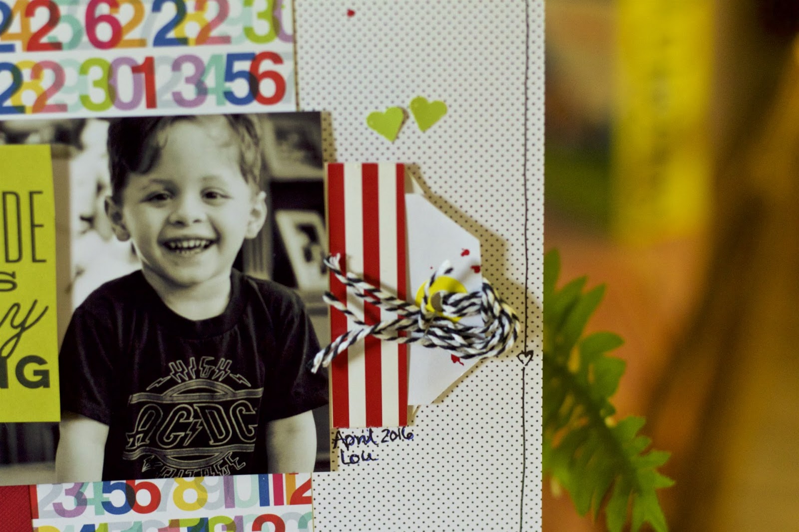
A crisp, white look sortof

with pops of red and other colors
made me swoon.
Although,
I was really torn on this paper because I really
liked the B-side which is really
cool ledger looking.
However, when I tossed this photo on this polka dotted paper with 
the fun, colorful numbers as a mat there was no debate. 
 And I didn't want to overwhelm everything either.
So I kept the embellies light.
And believe it or not, I love mists, I adore mists,
but I was really going back and forth whether to include 
mists on the page.
 I have also been trying to use that red striped bag
forever. It does have a gold heart emblazoned on it and
I think that was my problem because I have 
issues covering up cool things like that.
 I also doodled the outline.
I know.
I'll give you a minute to recover from your shock.
So Lou's sweet smile is front and center and
that was the goal.
I also love the PL card that I cut down.
I KNOW - I'm just breaking all kinds of issues
that have been plaguing me.
Studio Calico, Spellbinder leaves (I think) from my die cut box.
Those hearts match the card better IRL.
And the mist really added that something extra.
But I do love the crispness of the entire page.

OKay - so if you follow me, you know I have been extremely annoyed
with apple no supporting aperture anymore, so I stumbled
upon Aftershot Pro3 and after viewing a couple
of videos - took the leap.
Anyone use that photoshop? If so, let me know.

Aperture does so many things behind the scenes that don't
need thinking about and keeps a lot of hoop jumping to a minimum
that is causing a great stumbling block for me to
be able to move on.
However, there is going to come a time when Aperture is
going to cease to exist and I need to be ahead of that disaster
so I can access my photos in the future.
I think Aftershot is the closest to modeling Aperture.
Fingers crossed I didn't waste my money.

Tuesday, May 31, 2016

Birthday page without the "theme papers"

I love B&W photos.
They are so much fun to work with because everything goes
and reduces the clash of colors.
Isn't that owl adorable?? From a Halloween sheet that
I've been eking out and using sparingly.
 This adorable sticker came from Studio Calico I think
and when on some shopping spree found that cupcake.
Looks delish.
I did break out the die cut machine, punch and
fussy cut the "title".
 Love the arrows and shock upon shock
had that gray number that was 
perfect.
 The Studio Calico number page really
helped making it a celebration page.
I have so much paper and none of it "themed" really
so it was kinda of neat to do DIY.
Sprayed some SC color theory around just do
do something different.
I hardly ever spray mists anymore,
mostly because my spraying is totally out of control. 
LOL.

This is the third birthday for April - lots of grands in that month
and you got it - another one without a "theme paper"
coming up. If you check here another birthday page.

Tuesday, March 22, 2016

Circles- go round and round

I love circles.
They can be fun and happy.
And they can highlight something.
 This is a mix of Shimelle and Basic Grey.
I started the page with the happy photo and then
went digging in my die cut box.
 My die cut box is full of random die cuts
from random scraps.
Sometimes they work - sometimes they don't
but if I'm lazy and they work.
Win-win
 Using the positive and negative on the entire page.
 And then I felt the bottom of the page needed
a little something-something so I used
hearts
already punched from another project
that didn't make it to the page.
I find I'm quite liking the project life cards
for titles and such.
And Lou has such a great smile going on.

I'm also having issues with splattering mist.
How can you splatter wrong.
I can do it.
It either comes out OMG STOP or not enough.

Wednesday, May 27, 2015

Background paper that's a photo

By Studio Calico of course, and its New York
which is perfect as I gotta a couple
of grands in Brooklyn.
 Worked that badge in - points for that.
 I layered and layered with a mix of Studio Calico and
Paper Issues and also dug out the Studio Calico stamp,
stamped with black ink on white cardstock and colored it in with my 
American Crafts pink pen.
Love the look and the sentiment works because
Lou loves hanging at the Root's cafe.
The photo is sooooo pretty and delicate
and I picked out the colors
from there.
Lou is manly enough to do pink.

Tuesday, May 26, 2015

Stencil frenzy

I have been in a frenzy lately and this time
it's my pal Holli's fault.
She gave me the stencil - Tim Holtz arrows.

 I wanted a little dimension and color
so I mixed blue paint with the molding past.
 And decided to smear it over each and every one of them.
 On the entire page - which is going to be 8.5x11.
 Since I got carried away with the mixing I used
the leftovers to make dots on this page - that was going to
be THE page but I liked the other better.
 See those little stars???
They came in this month's Studio Calico kit and
when I tore open the package - they went
everywhere.
And I liked where they landed to I glued them all down.
one.by.one.
 My homemade enamel dots.
 The title. Sigh.
I didn't think of bounce til I glued down hop - which
is a QK cookie cutter font- cosmopolitan.
 Again with the chaos and I love.
After all Lou is bouncing around in a cage so......
This time I did add a bunch more layers and kept
the embellishments down to a mild roar.
I also mounted this on kraft cardstock and matted the
photo the same - along with some navy c/s.

Looks like Lou was having a blast.