Showing posts with label studio calico-pattern papers. Show all posts

Wednesday, May 27, 2015

Background paper that's a photo

By Studio Calico of course, and its New York
which is perfect as I gotta a couple
of grands in Brooklyn.
 Worked that badge in - points for that.
 I layered and layered with a mix of Studio Calico and
Paper Issues and also dug out the Studio Calico stamp,
stamped with black ink on white cardstock and colored it in with my 
American Crafts pink pen.
Love the look and the sentiment works because
Lou loves hanging at the Root's cafe.
The photo is sooooo pretty and delicate
and I picked out the colors
from there.
Lou is manly enough to do pink.

Tuesday, May 26, 2015

Stencil frenzy

I have been in a frenzy lately and this time
it's my pal Holli's fault.
She gave me the stencil - Tim Holtz arrows.

 I wanted a little dimension and color
so I mixed blue paint with the molding past.
 And decided to smear it over each and every one of them.
 On the entire page - which is going to be 8.5x11.
 Since I got carried away with the mixing I used
the leftovers to make dots on this page - that was going to
be THE page but I liked the other better.
 See those little stars???
They came in this month's Studio Calico kit and
when I tore open the package - they went
everywhere.
And I liked where they landed to I glued them all down.
one.by.one.
 My homemade enamel dots.
 The title. Sigh.
I didn't think of bounce til I glued down hop - which
is a QK cookie cutter font- cosmopolitan.
 Again with the chaos and I love.
After all Lou is bouncing around in a cage so......
This time I did add a bunch more layers and kept
the embellishments down to a mild roar.
I also mounted this on kraft cardstock and matted the
photo the same - along with some navy c/s.

Looks like Lou was having a blast.

Thursday, May 21, 2015

Stamping Frenzy

I believe I may have used them all. 
LOL.
Actually there are Studio Calico, Creative Cafe, Amy Tangerine,
Recollections and Dear Lizzy.


I actually love the chaos. 
Do you remember QK Stillettos alpha font??
I know it fits perfect in that space.
The hearts were stash from many kits ago and
they look great on the page.
Changed it up to 8.5x11 and mounted it on
black cardstock which makes it totally pop and I used
the reverse side of the paper to mat
the photo along with black cardstock - I thought
about layering more but I felt it
would detract from that lovely photo.
Of Sam.
And his blue eyes.

Thursday, July 10, 2014

Embellishments from pattern papers

It appears that someone is having a bad hair day.
And isn't she mz grumpy pants.

I loved the camera paper from Studio Calico of course,
and simmered it down a bit with some gesso.
Also because I made the page 8x8 I had leftover paper and
that allowed me to fussy cut the cameras out 
to use as embellishments.
Inking around the edges hid the unfussy edges I made.
Did some layering.
Found the ticket at the top that says make time for happy 
which cracked me up with the photo.
It also has boxes to check; today - tomorrow.
My check mark is by tomorrow since
 today wasn't looking too good for Mz. Amelia.

Wednesday, December 4, 2013

Layers, Stitching & some Stamping OH My


I love how that title just rolls off the tongue. Well okay - it's pretty well known I'm easily amused. And I wish I could say I was amused in building this page. It was a drive-by that started before I left for Thanksgiving. And there it was taunting me when I returned. From the cold tundra. With a sinus infection.

WAH WAH WAH !!! LOL!!!

 So here's a sneaky peak at all the layering that went on and use of negative space.

Of course it wasn't until after I glued everything down, along with pop dots that I decided it needed some stitching. I creatively curled the remaining thread around the tag to hang at the bottom to throw you off in thinking that I meant to do that.

:)

It totally worked right???


Then I had to find a photo.

So in order to keep the ole triangle going I stitched the arrows at the top and through the title at the bottom, and that means I can't be changing my mind about the title, and I really don't want to. 

I was trying to use the brick wall as a grafitti thing and I'm sure its been done. However, I am not at all confident in my drawing ability and I couldn't make up my mind about stamps to use so being the decisive person I'm known to be, I decided to use the grafitti paper that was in the kit. I'll go out on a limb and figure that's why Studio Calico put them in the kit.

A total win-win.

And maybe you'll notice that there's something I normally always do on a page - that I've not done on this page. 

3 guesses :)

Everything is Studio Calico & from their kits;  except pink paislee, sissix dies, washi tape.

Sunday, November 24, 2013

Using busy patterns together

I was restless and wanted to try something different.
And right there in my Studio Calico kit
was the clock paper.
Sigh.
I decided to calm down the clock paper some by smearing
gesso about and used a grey ink on a dot
stamp for added calming.

That's when I pulled out the wild graffiti paper from another kit. 
And.........
What do those 2 pattern papers have in common?

They both have black and white in them.
Shazam!! I know....
However, picture them bumped up against each other
without a buffer.
Very very scary for sure.

Therefore, a buffer needed to be pondered and I decided on black.
In addition to the black cardstock as a buffer I decided
to use pop dots and pop the entire block off the page as an added buffer
and to give it some distance.

I tied the twine around for some texture and while I was diggin about 
for "what I don't know" I came across this piece of metal.
Its the last of the metal that I purchased umpteen years ago at M's.
Its molding wire and is great for scrapping because 
it bends, shapes and cuts real easy and you can fold over those pesky
edges if you want and adds that something something - especially a boy page.

(I didn't know it was going to be a boy page - the photo came last).

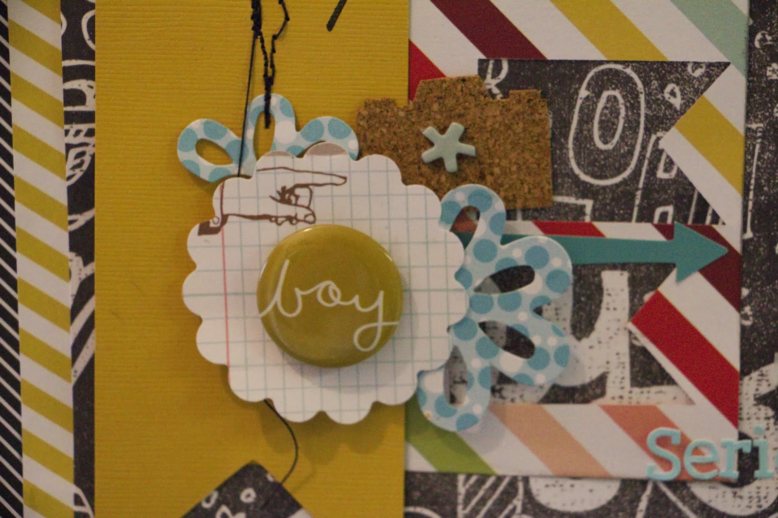
Then I found that perfect journaling card and the adorable clothespin.

I decided another color was needed and red is actually the perfect color
for both pages as it coordinated with the red on the card and clothespin.
Shazam!! again.

I used a sissix die and one is actually a 12x12. I managed to not
cut it correctly in the die machine so rather than begin
again, I just made it smaller. And that was better.
As I was removing the dots and stars and tossing them in
the garbage I had this idea that tossing them about on the page
may add a bit more so - out of the garbage they came.

It was fun, tossed them like confetti and where they landed is where 
they were adhered. 

So digging about in the wayback box I stumbled over this photo that
also had red in it. What are the odds.
I decided another layer was needed because the photo was just blending in
and now it doesn't. 

Karen Foster had the perfect alpha to use as a title, and that's when I saw it.
Drinking coffee at the scrap desk. I should know better.
Sigh.

Left corner on the clock-coffee stain, so in order for the page to not look too goofy, 
I used some Mr Huey shell to make more coffee stains. 
(Because one stain just wasn't enough ). LOL!!!

April said I'm out of control.
MOI?


Thursday, November 7, 2013

Last but not least....

and in full disclosure I was going to continue in the Halloween vein and I dithered about some being the decisive person I am. I also wanted to pack up by 5 p.m. because I was beginning to stiffen up so time was a-tickin' away.
I pulled out this kit (which was the one kitted at the same time "princess wave" was and begun to assemble the page. 
And I was getting frustrated because it wasn't coming together right.

I had a vision in my head. I was good with all the papers- just not how they should be adhered. Once that was settled I wanted to use the vellum again - in order to cut down the busy-ness but to also continue with the soft colors. 
I wasn't happy with the flowers I chose. And the rubons I used made me crazy. I dug around in K&Co and found that flower and I liked it but the bird brought in another color.
Heavy Sigh.
At that point, I called it a day because I was done.
I completed it at home, and changed up the pink and blue flowers to the lovely cream. I found that @ (for Annie) quite by accident and it was perfect because I totally went braindead on a title. I kept the K&Co flower because that corner had alot going on that needed covering and found some Kaiser craft gems and pearls that brought in the yellow/gold color. There's also cream magic mesh tucked behind the photo for texture and mostly to help with the rub on.
And then I found that itty bitty tag from Studio Calico and tucked it into the flowers.
It says "you crack me up."
Perfect :)

studio calico pp, basic grey pp & tag, k&co, kaiser craft gems, bazzill flowers, unk @

Wednesday, October 23, 2013

Blue eyed Girl

I wanted baby on there but I used up all the B's from this thickers package for crabby bird. LOL!!!

This is Amelia and her eyes. Love it. And the page is a lift of Wilna over at 2-peas in the mood videos.

I learned to mix gesso and gel mediums to slap into the evil templates that I used reusable adhesive to keep it in place.

I broke out the gelatoes and smeared them around.

I used the entire sheet of star transfers from Studio Calico - because Wilna was all like why not. Which is cool because now I don't have a half a sheet flopping about getting in the way.

The a mix of Studio Calico; pattern papers, thickers & Tim Beck alphas from this months kit, vellum die cuts & star rubons, then some Dear Lizzy, Fancy Pants and Amy Tangerine going on.