Showing posts with label flair. Show all posts

Thursday, August 27, 2020

Mixed Media album - Merry Christmas in July

Christmas in July seems to have made the big time
and more people are celebrating.
Here are the grandsons representing in their 
favorite grinch shirts.
I love the grinch.
So the pink and the red - meh - this was a premade
page that needed a photo - so ignored the red and I concentrated on
all the greens and got to USE a lot of stash.
Yasss!!!
Didn't need a lot of journaling and if one opens
the file folder
 (a die cut which makes me swoon) 
there are some TH sayings...

Love how fun it turned out.

Monday, April 29, 2019

The San Diego Zoo page

Since it was so much fun to do the Pima Air Force
Museum page on their map of the facilities
I decided that the San Diego Zoo map of the facilities
would totally rock the page again.
 Finally got to use the vellum hearts, and that paper
clip flamingo. 
I love flamingos. 
And let's not forget the flair. I've been trying
to use that for awhile.
 And of course the tickets, even my darling
sweet husband knows to hand over tickets and other
embellies at the end of the ride.
He's actually very good at that.
I had a lot of fun photos that I couldn't make a decision on
so I decided a collage was required on a 4x6
photo paper.
It turned out really quite well.
Didn't really need a lot of journaling.


Thursday, February 28, 2019

TN - Fun page of our getaway

to the Keys.
Key Largo - John Pennecamp - a lovely state park
that I wasn't sure I would like.
However, it started out 3 days and ended up being 5.
Love spur of the moment stuff and love
that it totally worked out.
I took this lovely photo and printed it as a 4x6.
Not that I wanted to, but I printed from my phone and
I am not familiar with that, I am still an aperture user
but lately updates has been making it weird, so now
I'm attempting to use photos and my phone.
The phone only has one choice.
The best thing about aperture is I can take 2 or 4 2x3 photos
and print them all on a 4x6 - NO waste.
Sigh.
😐
Photos is a joke. Really. And the superstar
Lightroom doesn't do it either.
So, enough with the whining...
As you will see, 4x6 landscape does not work in
the TN unless you split it in half
across the pages.
As my notebook is WAY TOO thick, it wouldn't
have worked out so I whacked the photo literally in half 
that fits on the page quite nicely.
Not the look I was going for but it worked.
 So using some die cuts and a flair as a sort of title
thing going on and a date banner because
when I stamped directly on the page
it was a bit screwed up because of the thickness.
Because of the way I took the picture,
I was able to split it.
I do love the result (and not wasting a 4x6)
and if was fun, we did use our bikes
a lot on this trip.

And, ta-da - this is the final page in this notebook
and now I get to start a new notebook.
Woohoo!
I think I'm going to try to keep it flat-er.
*Laughing hysterically*
I LOVE DIMENSION.
Sigh.

I changed the cover because it had 2018 on it
and of course I added 2019 photos into it.
I think you're supposed to run the month with
it but my months wasn't been exciting enough LOL.
It is quite thick.
Which is way I neeeeed to work on lack of dimension. 
Or not.
This book is now retiring to our storage locker and
I am currently working on a new one.
Exciting times as we are getting closer to hitting the road.


Friday, November 4, 2016

Some old Authentique

for the win on Jersey shore photos.
Of course what's the shore without googly eyes
on a QK die cut crab. The leaves the crab is
resting on is a Martha Stewart punch. I love punches.
 I used papers from my 6x6 pad I had forever, and
laid them out on 12x12 white cardstock in a quad format.
Quite old school.
Old school can be good.
 Finally used that flair button and didn't that work well
with the colors.
Loving doing sequence photos lately and because I have a bunch
they turned out to be fun and adorable.
Used some dylusions mists - and wa-la.

I like it.

Wednesday, January 28, 2015

My take on making your own flairs tutorial

After checking out some online tutorials about homemade
 flair badges I decided to check it out for myself and relate my results.
I know you're excited.
I was.
Would you believe I had to buy a one-inch punch?
Isn't that crazy.
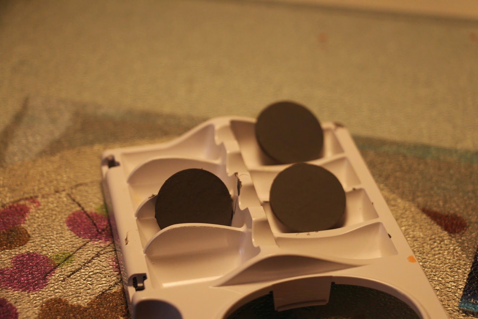
 I used my brand new one-inch punch and punched out 9 circles from some chipboard.
It was pretty thick chipboard - as I use them for my baby albums and
I like them sturdy.
 Glued 3 together to make the recommended thickness.
And then painted them gray.
As I made more due to some man-made disasters
I switched out to this less thick chipboard as the first one 
was threatening to break my punch.
I also decided to not paint them this time and honestly,
I'm okay with the "rustic" chipboard look.
 The less thicker chipboard with 3 glued still had the same thickness.
 I purchased some one-inch epoxy stickers at Hobby Lobby
 and I also had some glossy accents to test as well.
 I stamped some designs on regular pattern paper and used some
watercolors to make them pretty.
 Waited not so patiently for them to dry and added the expoxy sticker
and as you can see - it has the depth of a flair badge.
Below are my versions - I added die cuts, punched out labels too.
The one that says "its a girl" is glossy accent and really
you can't tell the difference.
The only fatal flaw is that you have to wait for it to dry.
Using a heat gun is disasterous and leaving it lay around can lead
to other types of catastrophes, such as laying stuff on top,
using a heat gun, and leaving your finger print as you poke it
to make sure its dry.
Just to name a few.
 The glossy accent was my 3rd try.
Just sayin.......
Above are my homemade flairs.
I will give this another whirl as I have some
other ideas in mind.
And below in a not so pretty photo - showing my badges
against the real deal.
They turned out pretty good and its nice to have the ability
to customize them.
As you will see below on a page.
The themed ones from Avacado Arts called my name -
actually screamed heritage.
As you know I adore heritage.
The black, grey, gold are lovely colors together
and they became the inspiration for this page.
 They are not as crisp as "real" flairs though the rustic-ness works well for this page.
Broke out my diecuts
And doesn't that photo make you swoon.
My great grandmother.
 And the doily.
Love the daintiness it brings.
I love how the badges worked out on this page, they really added flair.
yunk yunk.
If you give this awhirl, please share the results
I'd love to see them.

My great grandmother -as a young woman.
I have no idea how young - so I'm guessing maybe 20.
Its hard to tell back then.

Sunday, September 7, 2014

Loving my diecuts again

Linked up with Paper Issues tell me dies....LOL! love it.
Somewhere along the line my diecuts fell out of favor.
I have no idea why except maybe I'm lazy 
or it could be that the premade diecuts took an amazing turn
and really look great on a page.
And you didn't have to do anything to them, maybe ink the edges
but mostly they are ready to go.
And they looked awesome.
However, I have found that there are times such as scrapping late,
laziness or can't find the exact accent, that suddenly
my diecuts became favored again.

So maybe in another post I'll show how I took a bunch of leftover
papers and diecut a bunch just to have.
Now, I have an entire basket full of diecuts to go along with 
109837481374938482347832740 other baskets I have of embellishments.
No pressure there.
And I did make some tags.
No pressure there either.

Of course I used Studio Calico, along with my Quickutz 
and Sissix diecut into hearts circles, xo, and a flower.

Thursday, July 24, 2014

Studio Calico Patches

I only used one but patches sounded better than patch
which I believed I also used yesterday.
I'm getting redundant.
However, a patch in this case is like a girl scout patch.
And to be honest I had no idea what to do with it.
I have no clue why I was intimidated by it -
 I've used stickers bigger than this patch.
Anyway, the colors fit, well the red was a surprise
as it was the only color not in the arrow paper, and I loved
the sentiment, especially since this is Quintin's 
first no-training wheels ride down the street.
A rite of passage conquered.
Love that.

Lawn Fawn, studio calico, quickutz cookie cutters-lemonade.

Thursday, March 13, 2014

Vellum paper

I tend to forget about vellum. 
It became somewhat of a trend midway in the scrapbooking phenomenom
and of course I and everyone else jumped on that bandwagon.
And then like all trends it tended to fall away.
Well I happen to have some leftover from that trend and am 
bringing it back. Why? 
Because it is very versatile with its sheer, opaque quality. 
It can add elegance, soften patterns and mute colors.
It also can be a pain to adhere because the adhesive can be seen.
Unless your very stealthy in applying it.
 For instance, the only adhesive on the vellum is hidden behind the photo 
with a couple pieces of the washi tape. 
The top is being held in place by the tag and cloud. 
Stamping and writing on it can be tricky.
I used Stazon ink which will dry quickly without smearing.
Everything Studio Calico except for the tag- old Basic Grey that worked perfectly.
I love their face masks and I'd pretend to snowboard just so I could wear one.
Or maybe for Halloween - that would work for me.
Lessens the capacity for impending disaster.

Join in the fun over at Off the Rails Scrapbooking's first blog hop.
Click here to begin.