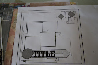
I was restless and wanted to try something different.
And right there in my Studio Calico kit
was the clock paper.
Sigh.
I decided to calm down the clock paper some by smearing
gesso about and used a grey ink on a dot
stamp for added calming.
That's when I pulled out the wild graffiti paper from another kit.
And.........
What do those 2 pattern papers have in common?
They both have black and white in them.
Shazam!! I know....
However, picture them bumped up against each other
without a buffer.
Very very scary for sure.
Therefore, a buffer needed to be pondered and I decided on black.
In addition to the black cardstock as a buffer I decided
to use pop dots and pop the entire block off the page as an added buffer
and to give it some distance.
I tied the twine around for some texture and while I was diggin about
for "what I don't know" I came across this piece of metal.
Its the last of the metal that I purchased umpteen years ago at M's.
Its molding wire and is great for scrapping because
it bends, shapes and cuts real easy and you can fold over those pesky
edges if you want and adds that something something - especially a boy page.
(I didn't know it was going to be a boy page - the photo came last).
Then I found that perfect journaling card and the adorable clothespin.
I decided another color was needed and red is actually the perfect color
for both pages as it coordinated with the red on the card and clothespin.
Shazam!! again.
I used a sissix die and one is actually a 12x12. I managed to not
cut it correctly in the die machine so rather than begin
again, I just made it smaller. And that was better.
As I was removing the dots and stars and tossing them in
the garbage I had this idea that tossing them about on the page
may add a bit more so - out of the garbage they came.
It was fun, tossed them like confetti and where they landed is where
they were adhered.
So digging about in the wayback box I stumbled over this photo that
also had red in it. What are the odds.
I decided another layer was needed because the photo was just blending in
and now it doesn't.
Karen Foster had the perfect alpha to use as a title, and that's when I saw it.
Drinking coffee at the scrap desk. I should know better.
Sigh.
Left corner on the clock-coffee stain, so in order for the page to not look too goofy,
I used some Mr Huey shell to make more coffee stains.
(Because one stain just wasn't enough ). LOL!!!
April said I'm out of control.
MOI?


