Showing posts with label mists. Show all posts

Wednesday, May 17, 2017

Really big letters for a title

So the oversized title works really well 
with the blue bird and heart. 
 Also used a black & white and color photo of Sam
with his adorable smile and cute hair 'do.
I reused the paper from his brother's page.
Did some background stuff with a rolling stamp and some mists
which still challenges me for some reason.
Love the big title.

Friday, January 13, 2017

Just a smidge off center

And there's a reason - there's this issue I've been having
lately with mists and the packaging technique.
It's been a flat out horror story - in fact there's one page
I seriously can't fix - that I may or may not ditch.
It's that bad.

Therefore in order to cover up said horror that strip
had to moved just a titch to assist in the
cover-up.
Feathers help too.
Now there's just a bit of color popping out 
that actually looks good.

Grands on a rock - they love the outdoors.
Pink fresh, thickers, and die cut feathers.
And mists 😐😐😐😐

Wednesday, January 11, 2017

Just adding a little bit more

I finished this page and while it looks nice
after I saw it in a picture - to me it looked well
meh.
 I tossed back on my desk and messed around with some more
embellishments and mists which added a touch more.

Just what was needed - nothing overwhelming.
Basic Grey - except for the hearts and flowers and nuvo dots.

Wednesday, January 4, 2017

Making spirits bright

with candy cane striped paper and a bit of dimension
with a sort of star stencil and modeling paste.
Didn't quite work out the way I envisioned.
 I fussy cut the title from a card because it was too big
and the berries because I liked them.
 Can't go wrong with mists - it can cover a number of sins.
And that QK flower is just perfect for the sin. LOL!!
Layers and some pink fresh Christmas words and
there you have Annie (Oakley) in her
pink cowgirl hat. 
I did this page before I started running out of the Christmas papers.

Tuesday, January 3, 2017

Ornaments and Angels page

This is what happens when one doesn't buy enough
Christmas papers.
Using a Studio Calico paper as a base page
and splattered some mists about
and bits and pieces of Pebbles papers.
 Using QK cookie cutters to make the "ornaments"
and dangled them with twine.
The angels, another QK die cut - and put some gold paint around
to pop them off the page.
And yes, I did die cut the photo too....
shades of long ago.
 The trees are another QK die and the sparkly
trees are called disco gold - got that paper from HL (I think). 
How cool is that.
They are so festive and fun!!
I did some stamping around and didn't like the outcome
so enter more mists using the packaging technique.

I have some gold ink to spiff up the wooden "shine."
It's a bit on the wild side. 
LOL!

Wednesday, December 14, 2016

The moose punch

Got together with my pal Holli over at her 
awesome scrap room.
I could totally shop there.
Anyway, she purchased this moose punch and made
me a herd of mooses to use at home.
Love that.
Love the quaintness of the photo and it totally called for a moose.
Like seriously.
Of course it needed a festive bow.
And how about those marshmallows in the hot cocoa.
Love how it turned out.
I was trying to pull colors for the mists from the photo
and I may have missed (get it). LOL.

Tucked in the glassine bag that is part of the mat,
is a PL card that says "It's the little moments that make life big."
AND journaling can be added to the back.

Studio Calico, Heidi Swapp mists, HL stamp, QK tag and frame.

Thursday, December 8, 2016

Going round in circles

Broke out the ole circle scissors.
I have a love/hate relationship with that tool mostly
because I'm highly uncoordinated.
Using the packaging technique with mists I pulled the colors
from the washi tape that came in the Studio Calico November kit.
I miss my firework, splash, grass punch.
It just disappeared one day and I KNOW I would NEVER
have given it away.
These splats are courtesy of my pal Holli who punched
a bunch in advance for me.

I think this turned out to be very fun with the circles and the mists.
Once again are those MAMBI alphas.
Studio Calico.

Owen riding the waves....

Tuesday, December 6, 2016

Presplatted paper and Arrows

The brown and gold splats came with the paper
and it was perfect for this
series of photos.
Of course I had to add more colorful splats with some hearts and stars.
 I thought arrows would be fun to roll through with the photos.
 Stamping some fun thoughts and that title is perfect.

TA-DA Annie caught the football

Fun page that helped in jump starting the ole mojo.
Studio Calico everything except the Quickutz arrows.

Wednesday, November 16, 2016

Bolder Pink Fresh papers

 Love the green and yellow colors.
Used some Nuvo dots - to scatter about along
with some mists.
 Added a big doily to ground the 2 photos
and added a bow mostly because I adore bows.
Opposite color flowers at the bottom of the page
with lots more mists and dots.
 I did use different colored greens - because
I really love rick rack and wanted to use it where
the colors separated.
And I love that leaf and it made a great place
for a title.

 Those green colors also bounce off Ms. Amelia's shoelaces.
Love it.
Those alphas are Tiny Stickers and they come in real handy.
Ms. Amelia does love her goofy faces.


Thursday, October 13, 2016

Lines and clusters

I had a vision when I started this page and
at the end I really didn't realize the vision but I still love the page.
I stamped the line across and used ribbon
and washi tape for this sequence of photos wanting to use
the lines as a "movement" and grounding.
 I kept the clusters really similar and near the photos
again to help in the grounding
especially since the lines aren't too straight.
I also wanted to use a lot of textures - thread, ribbon, washi
to work with the stamping.
 Using smaller photos they were able to be nestled in between
the lines with the clusters.
Since I had my QK emily out, I again, used this font
for the title using this green vellum
as well as for the photo mats.
I sewed around the edges and my machine
was totally wonky - so once I started I had to finish.
Sigh.

I added the journaling along the lines
and I think that pulls it altogether. It may not have
turned out to be my 'vision' but I like the end result.

Monday, October 10, 2016

Stamped clusters

I love making clusters - some work out
some don't.
These worked out and came out very fun.
I started with two stencils - Tim Holtz and Jenni Bowlin
circles - using black and gold ink.
Then using my favorite creative cafe stamps, roller
stamp from Studio Calico and hero arts and then, well stamped.
 I also misted with some Tim Holtz
and because I didn't have white mist - I used
white enamel paint to add to the fun.
 Because I only had one fussy cut cat, I used
a stamp to bring the cat around the page from Technique Tuesday.
And yes, the tags continue.


 Miss Amelia being fashion forward and
looking mighty lovely.
Dotted some stars and enamel dots around.
Love how it turned out.


Monday, September 26, 2016

Using the same design sort of

I'm okay with that.
Just got this fun paper on sale from Studio Calico
shopping on the road LOL.
 It's perfect for two little boys checking crab tracks
at the shore.
 I was in a giddy mood at the time
and gave the ole crab googly eyes.
Tossed some mists about.
Love these layers of old scraps.

Monday, July 18, 2016

Out of the mists arises a page

 You may remember this disaster from last week....when I dumped a half bottle of Mr. Huey all over my desk. I did have the presence of mind to clean up before more damage was done and then take the photo.

I did post this on Scrapaholics Anonymous for some well deserved sympathy and while not exactly a challenge, someone mentioned seeing the final product if I ever used the paper.

And I did.

After I completed the page I flipped it over to add all the goodies as I always do and it was hot pink and polka dots with a green blob.. which would've looked cool too but honestly where's the challenge in hot pink and green LOL.

So I decided to make another green "blob" on the other
side of the paper to balance it so to speak
and tossed some more of the mist about. 
I really like the color so I need to think about ordering more.

 I wanted to keep it kind of light and airy so 
I used those QK squares with some small accents
again, keeping to the green.
 The green was kind of getting carried away
so I found some cardstock really close
to the color of the page and added them as "filler."

I really love how it turned out and in hindsight
I would never have thought of using green.
Got to use some Heidi Swapp hearts and finally that
enamel flower. 

I had a blast taking these photos of these two favorite nieces
and at first they were 
all about the posing and then Caralynn decided
she was basically done when I was taking this one. When
I saw her "look" as I was taking it, it has
become my total favorite out of the bunch because it was so natural.
So that look was aimed at me and I was totally cracking up
behind the camera.
The journaling is also on the back because did I remember
to make a spot on the page. 
UH No......

Thursday, July 14, 2016

Sort of a chaotic mess

I'm really trying to figure out how it happened.
It was sort of like spaghetti - no matter how much you 
toss on there it just keeps getting bigger.
 I tossed
on a bit of gesso and some mists
using again the packaging technique and it just
went ka-boom.
On another note - 
Love that bird - he really makes me smile.
 So the mists sort of went everywhere, in non matching colors.
And seriously, there were so many colors on the
paper and what does Lynn do? Pick the
colors that weren't there.
Which honestly took the fun out of the page
as I kept looking at it.
So I figured I'd try and cover things up - but
this time I managed to get it so it
really couldn't be covered up.
Therefore,
 Since it was already out of control - I piled on.
I mean why not.
Gotta roll with the mists you splattered.
I threw on a 
disconnected title with some randomly placed stuff
all around because if you're gonna
be chaotic - make it CHAOTIC.
 I'm still wondering what went wrong.
LOL.
I had a vision and I'm pretty sure this wasn't it but
the pictures are fun and I think that started it,
after all leaping from rocks into thin air
is very daring.
I think the doodling pulled it all together.
LOL.
Studio Calico, Tim Holtz stamp and words, mists and
assorted bits.

Tuesday, July 12, 2016

So that girly skull and crossbones - used it!

It just happened to work for this page and
its not just for Halloween.
I did put some enamel hearts on the eyes as they are
shaped as hearts anyway it just seemed to highlight the girly-ness.
I did get carried away with the packaging technique.
 I also didn't use gesso either.
Which could explain a lot.
Anyway when I photographed this with the title
"strong" it was grey.
And I found hard to read. 
The color worked, but alas....
 For the final - I did go back and rub some
white paint and shabby chic'd it up
which makes it a tad more readable.
Love how this turned out.
Studio Calico, Stampin' up skull.
Miss Amelia is in tip top shape and she looks adorable doing it!

Wednesday, July 6, 2016

A crisp, white look sortof

with pops of red and other colors
made me swoon.
Although,
I was really torn on this paper because I really
liked the B-side which is really
cool ledger looking.
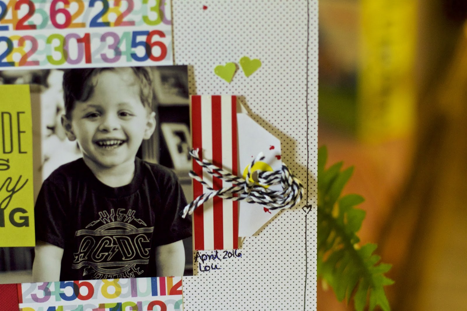
However, when I tossed this photo on this polka dotted paper with 
the fun, colorful numbers as a mat there was no debate. 
 And I didn't want to overwhelm everything either.
So I kept the embellies light.
And believe it or not, I love mists, I adore mists,
but I was really going back and forth whether to include 
mists on the page.
 I have also been trying to use that red striped bag
forever. It does have a gold heart emblazoned on it and
I think that was my problem because I have 
issues covering up cool things like that.
 I also doodled the outline.
I know.
I'll give you a minute to recover from your shock.
So Lou's sweet smile is front and center and
that was the goal.
I also love the PL card that I cut down.
I KNOW - I'm just breaking all kinds of issues
that have been plaguing me.
Studio Calico, Spellbinder leaves (I think) from my die cut box.
Those hearts match the card better IRL.
And the mist really added that something extra.
But I do love the crispness of the entire page.

OKay - so if you follow me, you know I have been extremely annoyed
with apple no supporting aperture anymore, so I stumbled
upon Aftershot Pro3 and after viewing a couple
of videos - took the leap.
Anyone use that photoshop? If so, let me know.

Aperture does so many things behind the scenes that don't
need thinking about and keeps a lot of hoop jumping to a minimum
that is causing a great stumbling block for me to
be able to move on.
However, there is going to come a time when Aperture is
going to cease to exist and I need to be ahead of that disaster
so I can access my photos in the future.
I think Aftershot is the closest to modeling Aperture.
Fingers crossed I didn't waste my money.