Showing posts with label studio calico stamp. Show all posts

Thursday, July 30, 2020

Back covers of the new 7x10 album

I used the same colors as I used on the front and it 
really worked well as it looks pretty similar to the cover which is pretty
cool since all the blowing makes it random.
Here's the link 

Since I'm in a campground in a small town
with NOOOOO craft stores in sight
I used my aspirator or baby snot remover.
Again, it does get the job done, however, watching the vids
the actual tool I'm thinking it would work awhole lot better.
Go figure actually using the right tool.
LOL.

The alcohol inks are raspberry, pebble, clover, butterscotch 💓
wild plum and stream.
On the inside cover I used the oxides and not the sprays
and those really cool Inkadinkadoo stamps.
Added a couple of TH phrases and a stamped "frame"
that went sort of out of control.
It wasn't big enough to go around the entire saying
so I had to do it in increments.
Chaos results. 

I'm not sure if I'm going to fill the guts with papers or just
wait and make the paper decision as I go.
I kinda like that - however, even if I fill it - I can and do 
change and rearrange the papers sooooo....
if I neeeeeed something to do - I could whack some papers.

The colors are salty ocean, pine needles, festive berries and dusty concord.

Tuesday, January 14, 2020

Birthday cards

Had some fun with them and won't the adults (ladies) love them.
I did the llama thing because that seems to be in now, 
and because it was cute.
I did use watercolors because I'm growing quite fond of them.
Hero Arts stamps and a really old birthday journal card
that I cut up because I wanted those candles.
And yes, they look similar, because it just flowed that way
and why not repeat the fun stuff.

Wednesday, October 18, 2017

Rustic mini album

I believe I mentioned that I had a bunch
of these sunflowers Holli stamped for me and
that you'd see more of it!!!
 I wanted to make a mini album as a gift for my pal Tobie
who is my boxbuddy for workouts.
And pulling all my papers out I didnt' really have a "theme"
going on. Not that a theme is necessary
it just helps when putting things together.
 In the process of trying to pull out papers and figuring things out,
I decided that in using the sunflower it really
wouldn't go with anything I had, but, I really wanted to use it
and then a lightbulb went off -
 Why did I have to cover up this chipboard with paper.
Hmmmm????
 A challenge!!!
 I did find some "rustic" cards, tried my hand at a "shaker"
we'll see how well that works LOL.
 Employed a bunch of stamps (fussy cutting), punches and buttons galore.
I really love how it turned out.
All the photo mats are 3.5x4.5 so if my pal uses
3x4 photos there's plenty of room even when I put 
embellishments near the mats.

Studio Calico stamps, various punches, Hero Art stamps, buttons
galore and cardstock.

Wednesday, May 24, 2017

4th of July cards

Yea Yea I know it's early but since we may be on the
road during this holiday and I love making
and sending cards to the grands,
I decided to have them ready and just dropping them in
the mail wherever we may be.
We are heading out sometime in June maybe - so I'm also
putting together my scrappy supplies for the road.
It's quite interesting.

Kraft, my sunburst punch for fireworks and Studio Calico star & heart stamps.

Friday, May 12, 2017

Last page for NSD scrapping frenzy

And this page works with frenzy so well.
In the still not overthinking it and starting to adhere and plunk
I took a time out to work in a 'stampede' with Creative Cafe
and Studio Calico stamps
because kraft paper can be so....well boring.
 However it works really well with Tim Holtz stuff, a Shimelle globe and
the story. Of which you will see I needed added
room for the story going on with this.
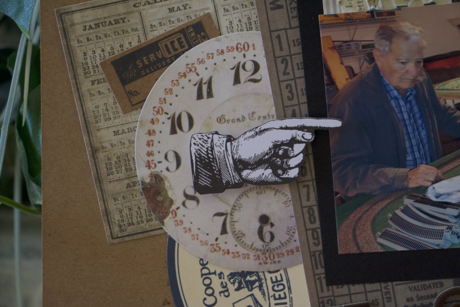
Here is my dad setting up another train platform.
He goes all out - the tracks will be laid, 
towns will be built and communities established.
And its fun to be the engineer.

Friday, March 10, 2017

Another Fond Food Memory

Back to Kraft and using some Basic Grey again because it really just
worked with the rustic B&W photo that I downloaded
from Lehigh Valley history on FB.
The moose is adorable and that just worked too.
I broke out some Studio Calico stamps and fussy cut
them out and found some wooden asterisks
and don't they add that extra touch to the page.
So this is Joe's Steak shop and when I was young we
would get some of his steak sandwiches for dinner
and his sauce totally set the bar for every other steak
sandwich I have had.
Love how this turned out and another story down
for my heritage album.

Thursday, October 13, 2016

Lines and clusters

I had a vision when I started this page and
at the end I really didn't realize the vision but I still love the page.
I stamped the line across and used ribbon
and washi tape for this sequence of photos wanting to use
the lines as a "movement" and grounding.
 I kept the clusters really similar and near the photos
again to help in the grounding
especially since the lines aren't too straight.
I also wanted to use a lot of textures - thread, ribbon, washi
to work with the stamping.
 Using smaller photos they were able to be nestled in between
the lines with the clusters.
Since I had my QK emily out, I again, used this font
for the title using this green vellum
as well as for the photo mats.
I sewed around the edges and my machine
was totally wonky - so once I started I had to finish.
Sigh.

I added the journaling along the lines
and I think that pulls it altogether. It may not have
turned out to be my 'vision' but I like the end result.

Tuesday, January 26, 2016

Stamping fun

These stamps came with my new kit and if you look really
really closely - you can see I used every single one
several times.
(Sorry for the color on this - I did it at my desk).
Because I cut this down to 8x8 size I only did
2 clusters in the corners of the page.
Also that party Tag- I knew that was going to go with this photo
so that needed to be worked in - and of course,
covered up some of the stamping.
HINT: Stamp way more than you think you'll need that way
some will actually be seen LOL.
 Had that black "tag" left over from the moon papers
that I used previously and that adorable
mushroom dude was from a cut apart - I fussy cut apart.
I took off his right arm by mistake and that
is why he's sort of tucked in there.
I had those Bella Blvd do-dads forEVER and
finally used every single one of them too.
The paper is older Studio Calico and I have been
digging my way through "older" stash.
Woohoo!!!
I'm pondering the winter Basic Grey warehouse sale.
But I still have so much.......
I'm waivering.
Sigh.

Wednesday, May 27, 2015

Background paper that's a photo

By Studio Calico of course, and its New York
which is perfect as I gotta a couple
of grands in Brooklyn.
 Worked that badge in - points for that.
 I layered and layered with a mix of Studio Calico and
Paper Issues and also dug out the Studio Calico stamp,
stamped with black ink on white cardstock and colored it in with my 
American Crafts pink pen.
Love the look and the sentiment works because
Lou loves hanging at the Root's cafe.
The photo is sooooo pretty and delicate
and I picked out the colors
from there.
Lou is manly enough to do pink.

Thursday, May 21, 2015

Stamping Frenzy

I believe I may have used them all. 
LOL.
Actually there are Studio Calico, Creative Cafe, Amy Tangerine,
Recollections and Dear Lizzy.


I actually love the chaos. 
Do you remember QK Stillettos alpha font??
I know it fits perfect in that space.
The hearts were stash from many kits ago and
they look great on the page.
Changed it up to 8.5x11 and mounted it on
black cardstock which makes it totally pop and I used
the reverse side of the paper to mat
the photo along with black cardstock - I thought
about layering more but I felt it
would detract from that lovely photo.
Of Sam.
And his blue eyes.

Sunday, April 12, 2015

Remember those old CD jackets?

Found ONE!
And its baaaaccckkkk!
They make the cutest little minis
and great for gifts.
Not too overwhelming.
So when and why did they fall out favor.
Inquiring minds want to know.
I noticed as I opened the jacket - there are 2 glued
together - as they should be.
Only one was upside down - as it shouldn't be.
 Undo does work its magic on old wet glue.
It wasn't pretty but it became undone
so I could flip it around and make it right.
It was a bit on the rough side
so I sanded the sides down just to even it out.
 And reglued it the right way. 
Now tags can be put in the pocket and they won't fall out.
 I inked the edges as I always do because
getting the measurements correct is really a crap shoot.
With the edges inked the booboos don't stand out like a sore thumb.
 I wrapped a single sheet of pattern paper around the spine
and I employed my bone crusher tool 
to burnish the paper to make it wrap easier.
 And then wa-la.
Like magic.
A completed mini album.
It's Quintin's 7th birthday and good think I looked
because I really wanted to make him 8.
 Of course in the photos he's 6 and under.
But who's counting.
And dangit I meant to add his birthday photo in it.
And forgot. :|
 However, its fabulous all the same.
Tucked away are tags inside where the CD would go
or maybe some playlist.
 I decided to get carried away and add glitter and paint
to the chipboard alpha and number.
As I was working on the page - the glitter kept getting all over the photo.
I solved the problem by a. putting modge podge 
over the characters AND b. putting the ectrochrome transparency
over the photo.
If you look real close you'll notice its backwards.
Oops.
 And the same set up on the next page. 
I didn't pull out the tag and I actually added a photo
behind the flap with one tag tucked in.
I was going to leave the back plain but just.couldn't.do.it.
LOL.
Stamp with white ink - came out pretty good.

All is Basic Grey.
Have I mentioned I love that collection.

Sunday, September 21, 2014

Working some layers

I find it easier to pile on the layers when
you have them right at hand.
And it was alot of fun to add them on.
Actually I find it hard to stop.
Scary, huh.
 Not only did I use my diecuts but I also have subscribed
twice now to Paper Issues goody bags.
And they are chockful of goodies.
I used a mix of course, and I'm trying to get stamps in there as well.
They do add a little something something but
I have a hard time with them.
Therefore I decided to do obvious at first while
I get comfy with it and then let'r rip.

Lou
loves to swing
Lou
loves to go high
Lou 
loves to fly.
Lou
is two.

Used a mess of stuff from Studio Calico, Quikutz, and Paper Issues.


Wednesday, September 17, 2014

Perfect papers, perfect photo

As I kept poking through my Echo Park
Capture life pack - it hit that there was a New York
theme going on.
And Brooklyn.
And when this photo of Lou came over the wire, well 
it was a match made in heaven.
Very fun papers.
This is Lou under the scaffolding - running through "his tunnel"
on the streets of Brooklyn.
Seriously does it get any better than that.
So......I added three strips of paper on the "tread" paper.
A beatle song and music.
Since dad is a muscian - that's a win in addition to Brookly/NY stuff.
The red edging was added after it was all said and done
because it just didn't pop off the page.
And now it does.

A little bit of Studio Calico - actually worked in the skyline stamp.
Go me.
And Basic Grey alphas.

Sunday, September 14, 2014

Border diecuts are cutting edge

There are a few languishing in my drawer that I forgot I owned.
Sad that I have so much I can't remember it all.
But its all coming back now.
Bam!
And because I didn't have enough paper already
I picked up the Echo Park Capture Life pack.
AND I LOVE IT.
The colors work perfectly.
And all the cutouts and stickers, oh my.
I used my "shine" stamp from Studio Calico on that
blank bannery card, works perfect.
However, now looking at the 3rd card - which is blue -
I should've put it in the middle.
Too late.

Anyhoo, I dug out my sissix border diecuts.
Love the delicateness of it - it doesn't take over.
So the confetti came from the border-all those itty bitty holes.
How fun is that.
There's a studio calico stamp, stars and badge.
Thickers.

First day of Kindergarten, always a milestone.
I shortened the title because I love that fun font but didn't
have all the letters.
I think its cool.
Hopefully someone/anyone will get it.

Thursday, August 14, 2014

Stamping and Sweetness

Just to be perfectly clear the sweetness comes from Samwise.
Love the sweet smile.
So there was a total stretch for the title.
I know you're surprised.
Again.
It was fun to pull out the stamps as I went because as
always this was "a flyby page,"
Studio Calico & Basic Grey stamps, on the adorable banners at the top,
and I handcut them. Simple Stories under the title.
Those fun arrows and it appears that those office tags are
making a comeback. 
I always liked those tags.
And didn't the vellum ones make you swoon.

Wednesday, July 23, 2014

Patching together a base page

That you can't see.
Because I didn't think to take a photo because
in the first design - 
you'd almost have seen it.
This is an 8x8 page.
Somehow when I whacked into it, it became a lesser size.
So I squared it off to 8x7.5 and used the remaining paper, the B side
and washi'd them together.
I then decided that looked really stupid and added some water colors
and running colors.
Found some vellum, the die cut and a photo and decided that
it needed to be over top the patch.
Because I found the awesome tag at the top and it took up room.

So that blue streak at the bottom is a studio calico stamp, along with 
everything else on the page except for the bazzill, qk die cuts and punches.
OH and I handwrote the title.
And I tried to go for a less beachy looking page. Not that I'm 
against beachy looking pages but I've done them the same way lots of times.
And I wanted something different.
Snap!

Monday, July 21, 2014

The Title inadvertently matches some of the embellishments

I KNOW.
Just occurred to me.....although potatoe / potahto.
Circles or rings.
Ring master.
Get it!!!
I can be sooooo witty.
or Not.
However I had the design going on with another title until my pal
April the titlemaker came up with ringmaster.
And it was like a head slappin' DOH moment as to why I didn't think of it.
And when I was looking for something witty as a title for my blog,
I happened to notice the similarity.
Clever eh?
Love the rings as an embelishment and whipped out the ole QK cookie cutters
and used each and every one of them on the page.
Everything except the thickers and washi is Studio Calico including the mr. Huey mist,
 and those stars came in this cute lil glassine package
 and I used every one of them too.
I'm totally on a roll here and using supplies.
Yay!