Showing posts with label grandsons. Show all posts

Monday, February 12, 2018

A pretty boy page

This page turned into a very pretty page for a boy page
and I'm oday with that.
 Love all the do-dads, project life cards and the small touches.
 Love the owl peeking out for a 
whimsical touch.
There is Sam and Lou sitting under a tree
 enjoying a treat on a pretty day.
Love the layers and especially that doily with some
light splatters of mist.
And that wooden hashtag is perfect.

Studio Calico.

Monday, March 20, 2017

This page gave me fits....

The entire weekend was utterly fits in
the scrapbooking world.
The mojo - has left the building......
Anyway I fussy cut this heart out because I wanted 
some dimension.
So I decided on white and managed to
get all the watercolors wrong.....
 I had this page laying around and the
watercolors still came out wrong.
I'm like seriously.......
You'd think I'd figure it out by now lol.

 But the navy blue was yummy - 
After I went so far as to splat some
white enamel on it (that came out with
some blue-green on it because I didn't change the water 😐 
I remembered that I wanted to use this with
another photo on another page.
Sigh.

All that turmoil, I decided that I really liked this "green'
which had been on the radar too and
 it turned out was the best pick.
Used my sissix die to make that ribbon...
and that adorable little bow came from the stash and
those two itty bitty banners were snips from
trimming off those strips I used on the ribbon.
So I kept this simple because frankly
it was making me nuts.

Studio Calico, Michael's wood title and Sissix.


Thursday, March 16, 2017

Hearts and graph paper - win

 I have a bunch of Pink Fresh papers so I decided
I needed to use some because I'm
really trying to keep supplies down to a mild roar.
Bwahahahaha!!!
Right.
Anyhoo, I did use the 6x6 pads to layer and they
did have that cool clipboard stamp that
is totally fun and has nothing to do whatsoever with the page.
And that Bugs Bunny peeking out - thanks to Holli
I punched a bunch out and love it.
Did splash some watercolors about using the packaging
technique (since I've sworn off mists for awhile) and love 
how it turned out. It kind of brought both sides of
the paper together and grounded the photo.
Had a really hard time picking out a photo but I went with B&W
because I felt it just worked.
So Pink Fresh everything except the title and chipboard pieces
that came from Studio Calico kits.

Wednesday, March 1, 2017

Rolling with another 4x4 photo on 6x6

I also rolled with the splattering of white paint
while I had it out and ready to go.
I actually splattered it before I added anything on the page.
I also rolled with basically the same design.
I'm okay with that.

I picked a card stock base mostly because of indecision
and the fact I didn't wanted want to whack down a 12x12
I wanted it to be a leftover scrap.
This card stock worked perfectly because it had
been whacked into previously.
 So I layered the photo and this top left corner made
me crazy because the layers were out of control so I made
this cluster to make myself happy about those goofy layers.
 I also sort of got the background idea from Inky Quill
but mine didn't work out as cool as hers #1.
and #2 I used a photo with lots of layers that I
put together before I came up with the layering strips.
Her's was not perfectly straight -but because the offset of the
strips with the gaps made me crazy -
 I whacked the strips sort of straight on each side.
Also because of the white space in the photo
to the left that's where all the embellishments were going.
I hadn't planned on that goofy corner so
everything lined up right down the left side
so in the spirit of the triangle
I added some enamel dots to the right.
The title came from a die cut from HL I got on sale
that's actually for a planner and didn't
it fit in the space quite nicely.

Sweet Lou - love that hat.

Monday, February 27, 2017

4x4 photo on a 6x6 page

Love the look - they are perfect sizes for each other.
It all started out wanting to use this paper that I whacked down
for something else. I also love that I purchased
two of each papers and I think I'll do that going forward.
Anyhoo, I really liked both sides of this paper and ended up
using the same side of this paper twice.
 Love the clusters going on at the top and bottom.
 And the "notebook" paper looks gives it lots of texture.
I also went crazy with different colors of green.
Also the white splatters - I have given up on white mists
and now just use white enamel paint watered down a smidge.
And it stays white and not a goofy grey.

Sweet photo of Sam.

Wednesday, January 11, 2017

Just adding a little bit more

I finished this page and while it looks nice
after I saw it in a picture - to me it looked well
meh.
 I tossed back on my desk and messed around with some more
embellishments and mists which added a touch more.

Just what was needed - nothing overwhelming.
Basic Grey - except for the hearts and flowers and nuvo dots.

Thursday, January 5, 2017

Paper piecing sort of

I love this Echo Park collection and I used quite a bit
so when I came across these pix 
that are totally perfect for them and because I didn't have enough.... 
 I used various strips of leftover papers and adhered them
on a 12x12 kraft paper and yeah covered it up totally
but I'm diggin' the result.
 Various embellishments - homemade and from 
the sticker sheet.
Went a little old school here.
Love it.
app
I used all the bits and pieces.
Really loved this line.
Love using all stuff I purchased without leftovers.

Connor picking apples - fun!

Thursday, December 8, 2016

Going round in circles

Broke out the ole circle scissors.
I have a love/hate relationship with that tool mostly
because I'm highly uncoordinated.
Using the packaging technique with mists I pulled the colors
from the washi tape that came in the Studio Calico November kit.
I miss my firework, splash, grass punch.
It just disappeared one day and I KNOW I would NEVER
have given it away.
These splats are courtesy of my pal Holli who punched
a bunch in advance for me.

I think this turned out to be very fun with the circles and the mists.
Once again are those MAMBI alphas.
Studio Calico.

Owen riding the waves....

Monday, November 7, 2016

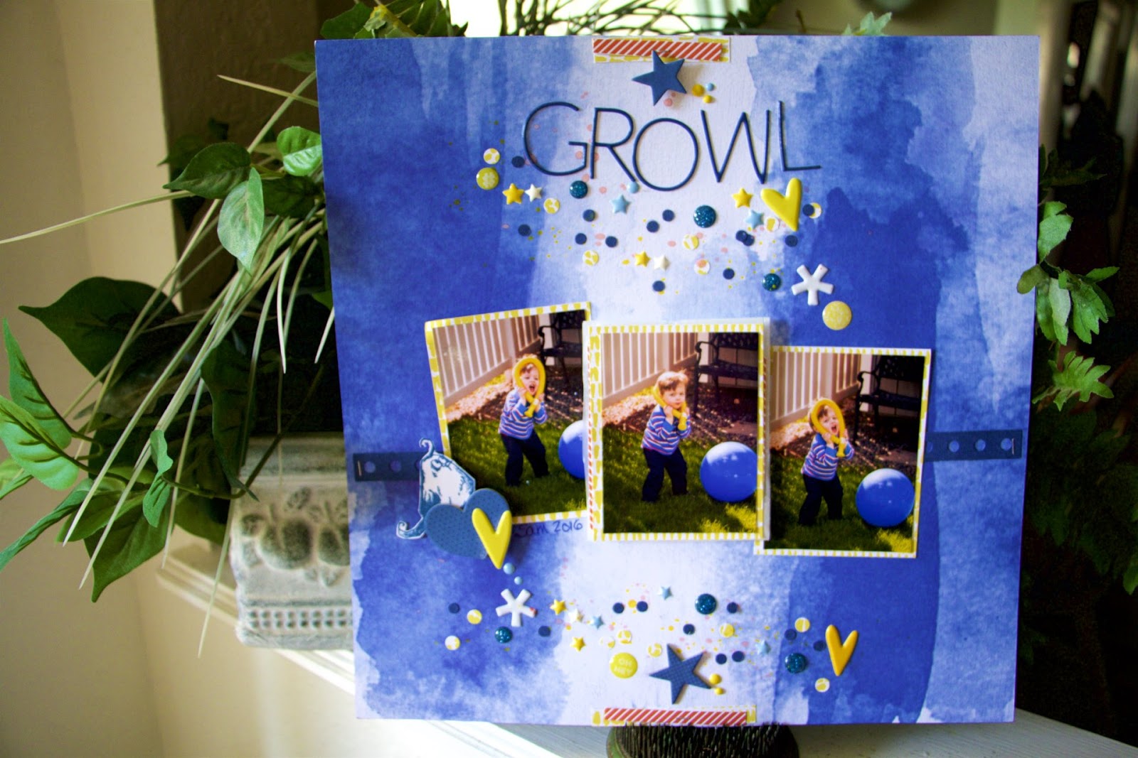
Scattered stuff

This page just sort of evolved without a plan really.
It started out with another photo sequence
that needed grounding so I used my Sissix die for a border strip.
And when the dots fell out all over the page,
well I just glued them.
And then added more in a different color.
And then there was a big blank space where only
the title could go.
 Love the little bird and I did him in blue that totally matches
and rocks the page and then
there's the strip that started it all.
 Of course the whole dot thing is repeated at the bottom of the page.
And didn't I use up a bunch of stuff.
 The touch of red was kind of an after thought.
I like it.
It's kinda wild and really different.
So Sam - looks like a 'lion' with the yellow balloon
around his head 'growling.'
Work with me here.

Thursday, November 3, 2016

Incoherent word stamping

because well sometimes it just
works out that way.
Especially when one stamps AFTER
one puts all the stuff on the page.
One can only hope one learns from this experience.
Uhuh.
 And then there's a touch of green.
It just seemed to work out especially when I popped
a flower on it from G45 that was
in my die cut box
and didn't that quite marry the colors together
because I really wasn't sure what colors to do.
 Yup. 
I totally need to rethink the whole
stamping when the paper is blank.
 Since my white mist was really lame,
I used white enamel paint diluted with some water
to splat the about. They're hard to see here
but in real life it looks really cool.
It was fun with 3 photos and I didn't realize
one was landscape hence my design.
Its quirky and fun.

Lou having a ball!!!

Thursday, July 28, 2016

Anyone else having trouble with white mists?

I really love having white mists on a page
and if you look at those grayish looking ones - that's
Heidi Swapp's white mist that I shook shook shook - 
I also have a recollections white mist - same result -
so when I tried a different tack - when
I altered the color on the title I tossed some white paint around.
That's the look I was going for.
 So that adorable little owl looked more red under my light.
hmmmm...he's on there now........
 And how about those glasses on the PL card - 
goes perfectly with momma's glasses.
And finally used that flower from Basic Grey.
How cool is that title...from M's $1.50 bin.
It had some pale yellow and tan hombre going on
that didn't fit with the rest - so I painted it white
to stand out more.
Although now looking at it, it may have worked
in its natural state.

Studio Calico, Bella Blvd (owl), Basic Grey (flower).
OH and I used the Martha Stewart heart confetti punch for
with the gold paper and oooooooo some are itty bitty but oh so
adorable.

Monday, July 11, 2016

Really Big Banners

I have been wanting to use that "plot twist" since I first
laid eyes on it. It was a PL card I cut down and
its perfect for this photo.
 I layered some papers behind the photo and used my "ripped
paper" punch that I really love.
 See what I mean?
Perfect.
I really loved this gold paper and that blue
really goes well with it.
I know!
Surprised me too.
I did use some other colors to bring it all together
and since those banners are over the top
I really didn't want a lot more on the page- so a
few stars and homemade enamel dots 
were perfect.
And doodling around the page was fun.
Basic Grey, Studio Calico PL cards, the title is
 from M's $1.50 bin.

Monday, June 27, 2016

A rainbow of colors

That is just too fun.
Love the stripes - it reminds me of fruit strip gum.
Is that still around???
I don't chew gum anymore. (sigh)
Anyhoo, used a bit of bazzill with punches, lots
of star punches as you will see.
 That tree die cut has been in my die cut/punch stash forever,
so glad I got to use it.
In full disclosure I did dither about with the title.
I just couldn't decide.
I did die cut a couple of titles that hopefully I'll use later.
One was one of those little alphas that you can do all the letters
in one couple of turns by Sissix.
They were too fat and chunky - but adorable all the same.
In fact the 2 is that alpha set.
The other is lemonade by QK.
Majority is Studio Calico stuff paper and PL cards and that 
yellow transparency.
Aren't those two adorable. 
As you can guess
I keyed the colors from their colorful jackets.

Wednesday, June 8, 2016

Different font alphas and a mix of colors

 I used watercolors on this mixed media page
and didn't use any gesso because
it sometimes leaves an outline that annoys me.
I pulled the colors from Sam's shirt
and also used watercolor to make a border around the page
because when I roll on something you see it a 
couple of times. 
And it needed it to not be so bare.
 Instead of journaling I decided to make the title
swing both ways.
And I love how it turned out.
Then there's that cluster which is totally adorable
moved around the page a few million times.
 I love the simplicity that focuses on the
photo and his intense concentration.
I'm so glad to see Thomas the Tank Engine is still around
they were fun books and did you know that 
George Carlin played the conductor in the Saturday series?
It was also my favorite youngest son's books and TV show when
he was that age and I still have his favorite book "Catch Me Catch Me" memorized. 
LOL.


Wednesday, June 1, 2016

Reworking a PL card and blog technical difficulties

Somehow in the creation of this page it
was published without me being aware of it until
I saw it in google+ that linked to nowhere.
I couldn't find it anywhere in/on or around my blog.
Which was very weird.
So I removed it from google+ and am now
reposting - so my apologies if you've seen it before and
went nowhere.
I am baffled as to how it happened, however, we all know
that technology works in mysterious ways.


So here is another page done in Soaphouse Mama style with
lots of bits and pieces with some mixed
media tossed in because why not. 
Is that owl not adorable?
Its and old Technique Tuesday stamp that I've had forever.
Below is the card I wanted to use originally,
however, I felt the color wasn't quite right.
As if, when you look - the colors aren't exactly matchy-matchy.
So......
 Using some bazzill cardstock, a star die cut from my
die cut box and a white pen.
Wa-la!
(I know....me and a white pen, drawing lines just boggles the minds
doesn't it LOL).
 The the collage photo - showing from birth to 8.
This page is a bit chaotic and I'm finding I like it.
Studio Calico, dies, stamps, and another non-themed paper
rocks the birthday world.